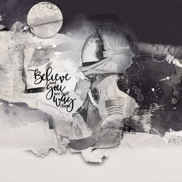
I add a lot of fun doing this layout, I love to work with black & white. I started by placing transfers and artsy transfers just to create my design ans set place for my photo. I also used pieces of the word art and brushes to create more interest. To blend my photo I used a mask form one of the Multifoto Template Album N0.3 and clipped my photo in several of the layers. I design this with the solid paper no.1 on the background but later I added the solid paper no.4 only at the top. I finished this by adding a multimedia moon and the word art. Thanks for looking!


