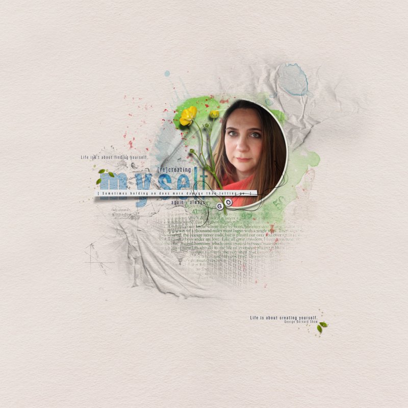
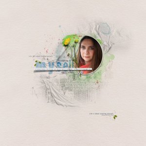
The last few years have been complicated for me, and I try to define myself again. This is a note for me, from myself.
Creating process:
1. I started my page with the UrbanThreadz FotoBlendz Frame and cropped my photo to it.
2. I did experiments with several background papers (from solid to artsy) - but finally I had a decision for a solid paper (what a surprise... :D ).
3. I placed several brushes under the photo and recolored them (green and blue).
4. I added the first quote (Sometimes holding on does more damage than letting go) using the OwnersXNarrow font (medium). I placed a new empty layer under the text, then I selected an area with Polygonal Lasso Tool and filled it with White color. I added a paper style Pattern Overlay layer style to it and rasterized the layer style. Finally I added a drop shadow layer style to it, created a new layer from it, and deformed the shadow layer and added a Gaussian Blur filter to it.
5. I added some realistic elements and created its shadows in the previous way.
And I thought for a day that I was ready with my page. But today I have new ideas, so I continued... :)
6. I played with the font I found yesterday - and created the title myself: I used some variations of the type from letter to letter: XBlack - Black - Bold - Medium - Regular - Light. I used blue color and set the Layer style: Color Burn, Opacity: 86%. I added a Stroke layer style to it, too.
7. And finally - really! :) - I added another quote from George Bernard Show to my page.
Thanks for looking!
Eszter
