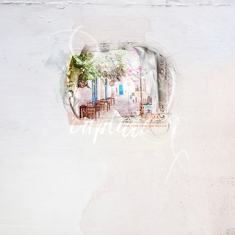
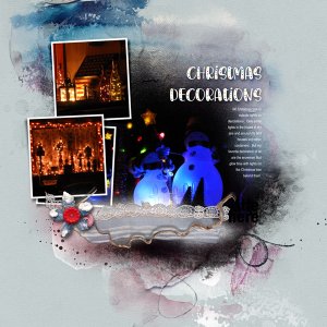
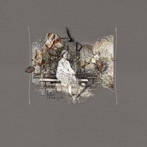
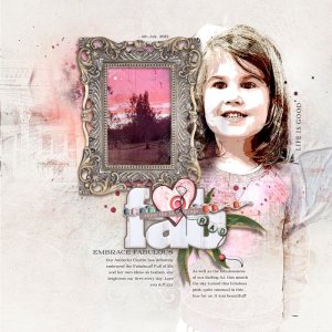
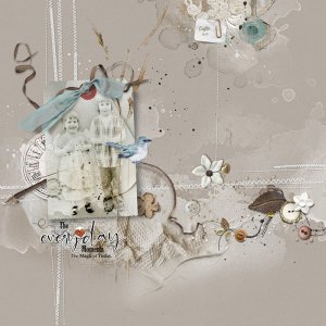
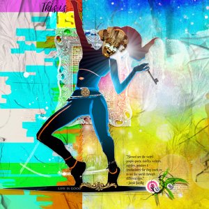
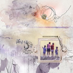
For this layout I used [URL='
https://www.oscraps.com/shop/ArtPlay-Portiere-Collection.html'][B]ArtPlay Portiere Collection[/B][/URL], which [B]on sale[/B] for a limited time.
[B]Process[/B]
Started with SolidPaper3 and rotated. Added ArtsyTransfersPortière_4 and played with some of its layers: a photo was added and clipped to the white paint layer. Both was duplicated 6 times and each paint layer was set to Color Burn. FotoGlow was added between one of these layers ans was set to Overlay. Other layers of the ArtsyTransfer were recolored to match the colors of the photo. ArchiTextures, overlays and strokes were also added. The page was completed by adding WordArt (ArtsyPaper3 was clipped to 'capture' WA and the WA layer was set to Color Dodge; SolidPaper1 was clipped to the other WA and the WA layer was set to Linear Burn - both of these layers were duplicated 3 times).
Thank you for looking,
[I]Dorci[/I]
