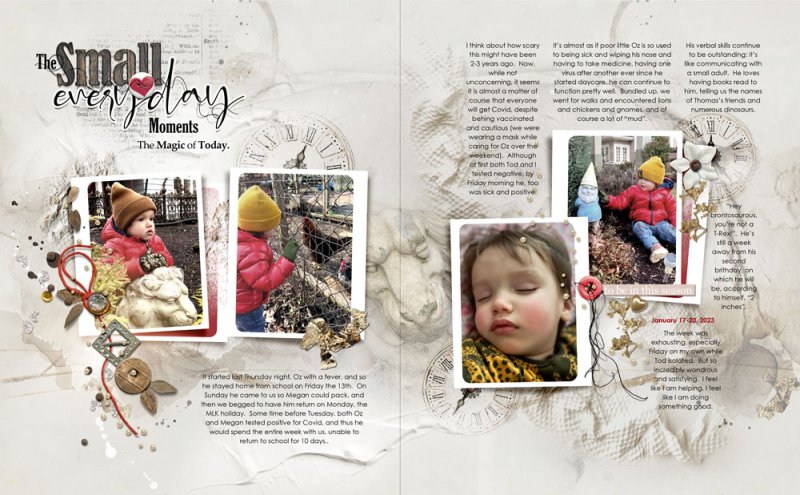
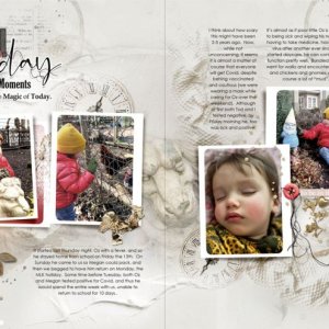
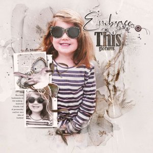
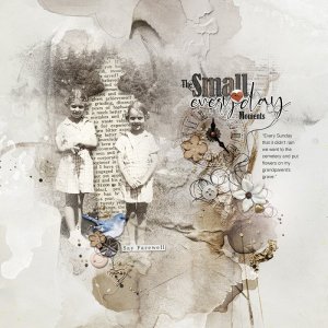
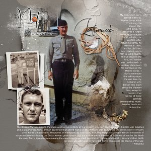
This is an adaptation of Suggested Layout #4 from the Sayonara Collection. Background paper was duplicated to extend across both pages.
Frames are from the Sayonara Artsy Layered Template, again duplicated (with a solid color fill in the "A" frame).
The Clock element was set to Color Burn, duplicated and changed in size and orientation.
Three of the four photos are desaturated by adding a Hue/Sat Adjustment layer, setting it to about 50% to reduce the brightness of the red jacked and yellow hat.
String and button elements are also Hue/Sat adjusted to be more red.
