Oscraps
- Credits list
-
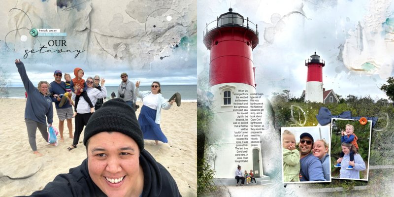
Scenic Template Album No 5 https://www.oscraps.com/shop/Scenic-Layered-Template-Album-No-5.html
Multimedia Branches No 7 https://www.oscraps.com/shop/MultiMedia-Branches-No-7.html
Break Away Artsy Transfers https://www.oscraps.com/shop/ArtsyTransfers-Break-Away.html
Background paper and transfers: Break Away Artplay Palette https://www.oscraps.com/shop/ArtPlay-Palette-Break-Away.html
Various buttons and word labels from Artplay Palettes
- Designer(s) Used:

