Oscraps
The Twilight Zone
- Miki
-
- Tags
- television twilight zone
- Credits list
- On Sale August 10-16
AnnaRelease 07 August 2020
Artplay Palette Twilight Zone
Artsy Transfers Twilight Zone
Twilight Zone WordART Mix 1
Twilight Zone FotoBlendz 1
MultiMedia Magic Sprinklez
Sparkle Dots
Process
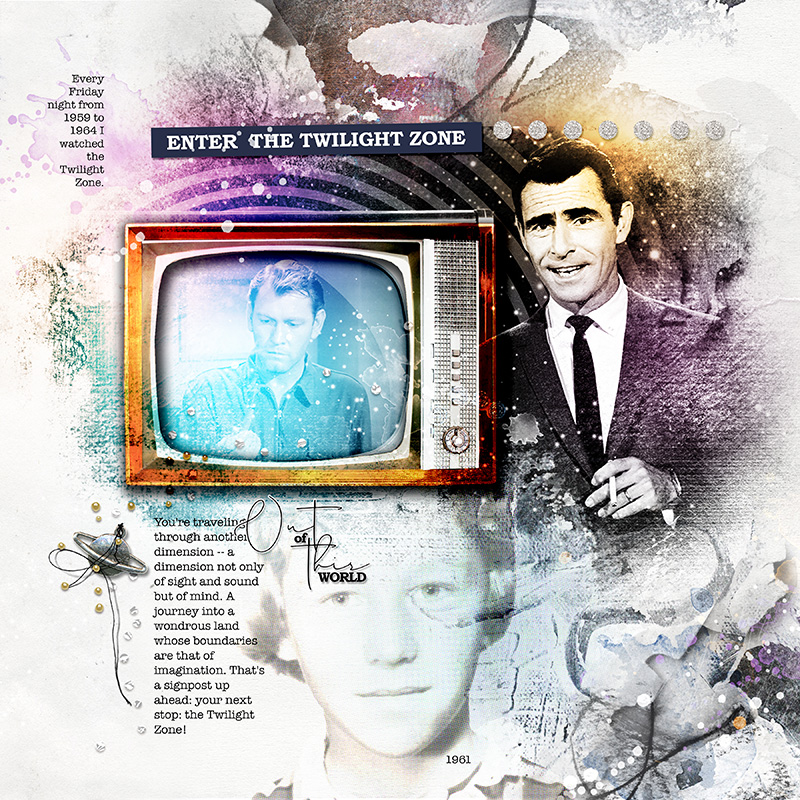
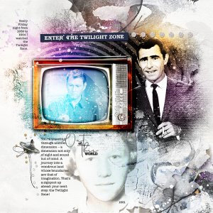
A solid paper from APP Twilight Zone was used as the foundation of the page. Artsy paper 1 was layered above the solid paper and moved to the right several inches. A layer mask was added and with the gradient tool the papers were blended together seamlessly. The photo of Rod Sterling (from the internet) was clipped to a horizontal Twilight Zone fotoblendz psd. mask. The photo was duplicated several times and clipped to various layers. All the layers were merged, then the merged image was duplicated with the blending mode changed to hard light. The TV was layered over the image with the cracked screen erased to allow a portion of the main image to show through. The blending mode was set to color burn, duplicated with the blending mode set to hard light (reduced opacity). The photo of me was extracted, converted to black and white. Using the hue/saturation adjustment tool a faint sepia tone color was added. The extracted photo was duplicated. This time a half tone pixelate adjustment was added (for more definition). Stains and splatters from AT Twilight Zone were added. The page was completed by adding word art, journaling and dimensional embellishments.
Thank you for looking!
- Designer(s) Used:
