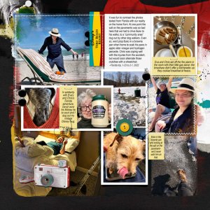
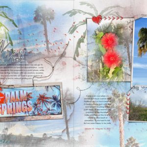
This layout is about the contrasts between me in the Northeast with my grand-dog and my daughter on vacation in Florida. It got super-crowded and there was a crazy mish-mash of colors, not the least of which was the bright resort logo. So most of the work was organizational and happened in the background, with the choice of Artsy Paper and recolored FotoInspired Edge Templates to try to bring some sense of unity to the page with a series of visual triangles. I chose to go for a dramatic look because the facing page is saturated with deep color, and I didn't want this page to be washed out by comparison.


