Oscraps
- Credits list
- Artplay Bountiful Collection
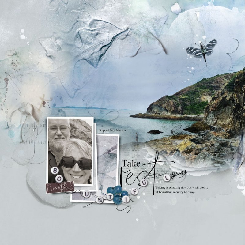
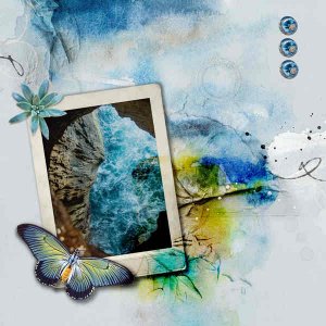
Process I took an Artsy Paper and adjusted the Hue/Saturation to better suit my images. My focal image was placed over the area of white space and was blended via a Layer Mask and Brushes. My image was then duplicated twice with different Blending Modes applied. Frame Layers from the Bountiful Artsy Layered Template (included in the Collection) were dragged onto my layout along with some Splatter, Tape and Transfer Layers. My supporting image (adjusted to a light sepia colour) and artsy papers were clipped to the Frame Layers before dimensional elements, Wordart and journaling completed the page.
- Designer(s) Used:
