Oscraps

Volleyball
Miki

Volleyball

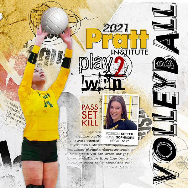
I was inspired by Frani's volleyball page. Like her, I steal photos from Instagram, Facebook and webpages (reason for poor quality of the images).
Credits list
Artplay Palette Sports 1 (retired)
Artplay Palette Word Hard Play Hard (retired)
FotoInspired Pack 2R (frame)
Sports WordART 1 (retired)

Process
An artsy paper from APP Sports was used as the foundation of the page. The image was extracted, duplicated with the blending mode changed to soft light (reduced opacity). An overlay from APP Work Hard, Play Hard was was layered between the images with the blending mode changed to overlay. A custom shadow was added.This added some texture to the poor quality photo. The volleyball was extracted with a shadow added. The smaller photo was clipped to a frame from page 5 of the FIT Pack 3R. An overlay from APP Sports was added along with some brush work. The page was completed by adding word art.

Thank you for looking!
Designer(s) Used:
  1. Anna Aspnes
Love everything about this page Miki! Love the title down the side that has those squiggly lines that shows movement.
 
Love the energy, so proud. The wordArt and typography, the yellow. And she's so beautiful!
 
This is so fun and bold, love the dimensional volleyball! Phew I spent so much time at volleyball games and tournaments!
 
Love this eye-catching page and the feeling of action that you have captured. Great title LO and font.
 
Striking page Miki!! I love the extracted action image coupled with the framed one. All of the different text you've used really adds a lot of interest.
 
This beautiful design is a feature in the AnnaLift Challenge!

Volleyball . . . by Miki recreates the energy and excitement of a volleyball game. The extracted figure is bold in her uniform. As she reaches for the ball, our eyes are pulled up the design toward vibrant word art. Miki repeats this vertical movement with her title which is a mix of bold black and thin letter overlays. Key phrases and subtitles have accent colors of red and golden yellow. Washes of color ground the figure and the framed close up of a smiling face. Artsy strokes are used for added emphasis on the ball and the “O”. Miki shares her stunning artistry to inspire our artsy memory keeping.

Thank you for the inspiration!
 

Layout information

Category
Anna Aspnes
Added by
Miki
Date added
View count
768
Comment count
9
Rating
0.00 star(s) 0 ratings

Image metadata

Filename
vb2_Miki_09.20.21_600scr.jpg
File size
216.6 KB
Dimensions
600px x 600px

Share this layout

Top