Oscraps
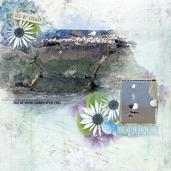
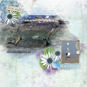
End of Summer
- Credits list
- Kit: Hors Saison (full kit) by Simplette | Oscraps — https://www.oscraps.com/.../Hors-Saison-full-kit-by...
Accents: Hors Saison (accents) by Simplette | Oscraps — https://www.oscraps.com/.../Hors-Saison-accents-by...
Brushes:
Texture Brushes 01 — https://www.oscraps.com/shop/Texture-Brushes-01.html
Stitching Brushes Basics — https://www.oscraps.com/shop/Stitching-Brushes-Basics.html by Karen Schulz Design
I opened a blank document, then dragged several of the accents onto that it. I desaturated, resized them as needed, and then merged visible layers to create the mask I followed Eva's process quite closely to make the textured overlay. Then I clipped my large photo to the mask and erased some areas to give the mask a tiny bit more textures. When that was done, I added some elements for the clusters and some stitches to hold down the smaller photo.
- Designer(s) Used:
