Oscraps
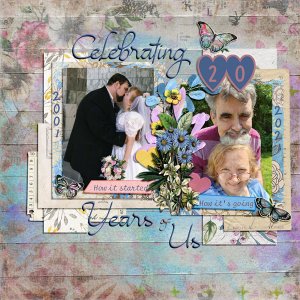
Celebrating 20 Years of Us
- scribler
-
- Tags
- anniversary love
- Credits list
- 52 Inspirations 2021 - No 33 Grungy Botanicals One from Joyful Heart Designs,
52 Inspirations 2021 - No 4 New Hope Artsy Papers, 52 Inspirations 2021 - No 5 Bonus New Hope Solids, 52 Inspirations 2018 - No7 and 52 Inspirations 2017 - No 22 Vintage Botanicals from Vicki Stegall
52 Inspirations 2018 - No 12 Flea Market Finds and 52 Inspirations 2018 - No 11 Papers from Crafty Button Designs,
52 Inspirations 2020 - No 37 Butterflies from Vicki Robinson
52 Inspirations 2020 - No 17 Mini Kit from Regina Falango
Fonts: KG I and Love and You, Magenta Rose, Selectric Script, GelPen
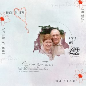
Photo Credits: Wedding Photo by Roger Bee Photography. I own the negatives. The selfie is my own.
I added a 24 px Outer Bevel to the words in my title, so it would look more like they were cutouts from paper. I changed the blue color of the New Hope Artsy papers using Image>Adjustments>Replace Color in Photoshop. (This is the paper I used for my photo mats.) I changed the color of the purple leaves (they used to be yellow) in my flower cluster using TrishD's Color Change tutorial from August's Lynne AnzelC Designs challenge. I added the paint to the background by setting a blue and purple artsy paper from Crafty Button Designs. I set the Blend Mode to Darker Color and used the Underlying Layer slider so the paint wouldn't look like it was just lying on the page. I then added a Layer Mask and erased the portions of paint I did not want to use on the page. For the inked edges on my word strips, I used a tutorial from Mye de Leon.

