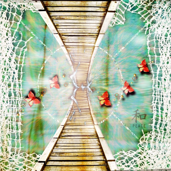
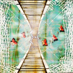
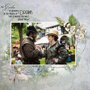
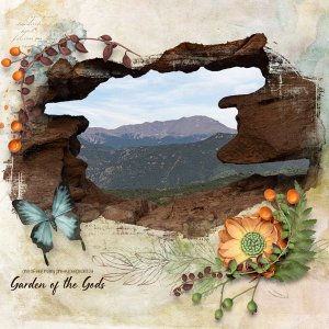
It’s almost a reflection. I’m having a bit of a hard time with being creative & this was the result of playing & didn’t think I’d be using this idea.
I don’t use photoshop so I had to do it a little differently but both apps are similar in some ways.
I’m having a hard time keeping it short with what I did. I’ll do the shortest explanation I can & all questions are welcome. I use Procreate & if you are not familiar with it, it is a graphic art app that uses layers
Background & peace word art I used directional Perspective blur into the centre.
The net edges & butterflies (done separately but similar steps) I created a mask below the objects & coloured it black, moved it a bit then used Gaussian & motion blur.
I created on top of the black mask a grey overlay using colour burn blending mode & 50% opacity. Then it clipped it on the black mask & used a brush & lightened the darker parts. I purposely left the black dark under the butterflies.
The water splash iin the centre i overplayed with grey cb 50% overlay & used black & white brushes. I also used bloom just with pencil to make it stand out a little more. I put a mask underneath, Gaussian & motion blur. Reduced its opacity.
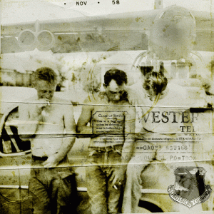
There is a photo in there. I added the photo & used it to cover the canvas. I changed blending mode to colour burn & reduced to 50%. So now the darker parts of the photo stood out & it was reduced opacity the photo effected the lower layers so I created a grey overlay covering the whole layer above the photo, changed mode to colour burn, reduced opacity to 50% & coloured white on darker bits & then a had few darker bits stand out. To reduce the darkness of the photo I created a mask using my brush on areas I wanted to stand out & clipped photo on to that & then added a overlay of the photo to blend it all together. Might sound strange but it worked. Lol & each part was needed. The 2nd top layer I created in a light pink to soften On CB mode & 50% opacity.
