Oscraps
- Credits list
- Credits:
ArtPlay Palette Weihnachtsbaum by Anna Aspnes
[retired]
AnnaBlendz Artsy 4 by Anna Aspnes
Canvas Textures 1 by Anna Aspnes
Bokeh Burst Brushes by Karen Schulz
Still Life Collection: Love Story 12x12 Overlays by Joanne Brisebois
Font - Effloresce
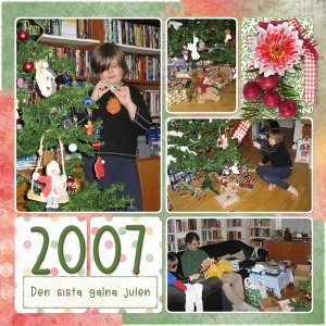
Photo: my own
Translation:
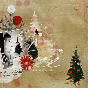
John is decorating the tree 2001
Steps:
I used an old layout from 2011, that I've been thinking of redoing for a while. Added a new layer, colored it gray, changed the blend mode to Burn and lowered the opacity to 50%. The tree in the botton right corner got a bit dark, erased a bit of the top layer using one of Anna's brushes. Added a new layer on top of the bottom layer, picked a color from the background, and played around a bit with a canvas texture brush. Then I added an overlay from Joanne between the layers, picked the color from the flower on the layout and changed the color of the overlay, and then changed the opacity to 47%. Then I didn't really like that the red circle was brighter than the flower. New layer and used a brush to paint over the circle with a soft brush, changed the blend mode to Linear burn, and lowered the opacity til I felt it matched the flower better (45%). And finally, I added some Bokeh circles with a brush from Karen Schulz. These I added on a layer on top of the Burn layer, to make them less visable.
- Designer(s) Used:

