Oscraps

Challenge 3 Artist Inspiration
Betty Jo

Challenge 3 Artist Inspiration

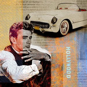
James Dean - 1950's Inspired by artist Gery Luger
Credits list
KardStock Neutrals No. 1 – Anna Aspnes https://www.oscraps.com/shop/KardStock-Neutrals-No.-1.html
PinStriped Textures No. 1 – Anna Aspnes https://www.oscraps.com/shop/PinStriped-Textures-No.-1.html
ScripTease Gratitude No. 1 – Anna Aspnes https://www.oscraps.com/shop/ScriptTease-Gratitude-No.-1.html
Labeled No. 2 – Anna Aspnes https://www.oscraps.com/shop/Labeled-No.-2.html
Photos: Pixabay
Designer(s) Used:
  1. Anna Aspnes
  • Like
Reactions: DomiD
This is fantastic, Betty Jo! You captured the spirit of Old Hollywood with that pink cast. Oh my I always forget how handsome he was! I LOVE this so much! I'm giving you a standing O for bringing back such a nostalgic feeling!

March 2021 - Standing O's | Page 2 | Oscraps Digital Scrapbooking and Artist Community
Thanks so much, Cheryl. The Hollywood is actually the Hollywood hills sign turned on it's side but with blending it's hard to tell. When I saw that handsome photo of Jimmy, I couldn't resist. He had such a short life, but amazingly he is still famous all these years later. ♥
 
Last edited:
Everything is well thought out in this layout : the diagonally strips on the left, the old and charming colors, the nostalgia to see James dean again! Congrats on the Gso!
and thank you for playing along !
 
Everything is well thought out in this layout : the diagonally strips on the left, the old and charming colors, the nostalgia to see James dean again! Congrats on the Gso!
and thank you for playing along !
Thank you so much, Marie Claire. This was such a fun challenge. ♥

 
Oh the memories! :) I love the Hollywood side turned on its side, because James certainly turned Hollywood on its side (and all around) :) I love your artistic magical touch on the design. Beautiful.
 
Oh the memories! :) I love the Hollywood side turned on its side, because James certainly turned Hollywood on its side (and all around) :) I love your artistic magical touch on the design. Beautiful.
Thanks, Danesa. Yes, he definitely did. When I turned the sign on its side and did a color blend in PSCS it made it look like flames on the photo. I almost removed them, then I thought, nope, he certainly set Hollywood on fire in his short life.
 

Layout information

Category
Challenge 3
Added by
Betty Jo
Date added
View count
1,308
Comment count
12
Rating
0.00 star(s) 0 ratings

Image metadata

Filename
Challenge3_ArtistInspiration600.jpg
File size
244.7 KB
Dimensions
600px x 600px

Share this layout

Top