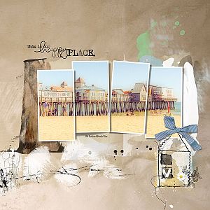
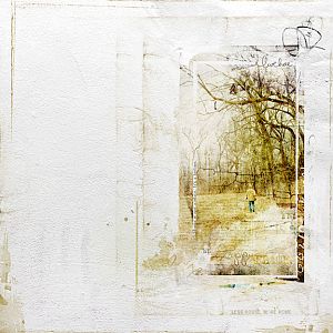
When I start with a kit I like to look at the papers and think what would look good with these. In this case I thought beach. I went to Lightroom and did a search on the keyword beach and found this picture. I took the three landscape frames from Artsy Template 136 and moved them onto my page. I turned them 90 degrees. Next I copied one of the frames placing it at the beginning and slight lower than the other frames. I added my photo to each of the photo masks using the Create Clipping Mask in the Layers menu. I placed Transfer 4 from APP Home behind the photos because I like how the brown mirrors the pillions of the pier. I added transfer 11 to the right side so the curl of colors was at the top as I felt this looked a little like a wave that crashes on the rocks and falls back on itself and the white paint helped contain the photos. I erased the parts that didn't support this idea. I played with the Hue and Saturation adjustment to reduce the brightness of the colors. I used blue paint and Brush 8 to fill in the circle and inverted to paint on the right side. This brush is bricks so I added a motion blur filter to this layer to blur the look
Congratulations!! Your layout has been featured on today's Gallery Standouts Blog! http://gallerystandouts.com/fingerpointing/2019/finger-pointing-march-6th-4/
This site uses cookies to help personalise content, tailor your experience and to keep you logged in if you register.
By continuing to use this site, you are consenting to our use of cookies.