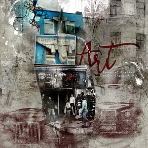
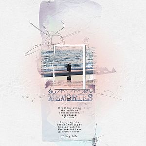
In 2009, I fell in love with the streets of Camden, England.
Products: Anna Release August 5: http://www.oscraps.com/shop/AnnaRelease-5-August-2016.html
Including:
Artsy Layered Template #230 http://www.oscraps.com/shop/Artsy-Layered-Template-No.-230.html
Antiquity Artplay Palette http://www.oscraps.com/shop/ArtPlay-Palette-Antiquity.html
Antiquity WordArt Mix No. 1 http://www.oscraps.com/shop/Antiquity-WordART-Mix-No.-1.html
ArchiTextures No. 6 http://www.oscraps.com/shop/ArchiTextures-No.-6.html
UrbanThreadz No. 11 http://www.oscraps.com/shop/UrbanThreadz-No.-11.html
Additional products:
London Brushes No. 1 http://www.oscraps.com/shop/London-No.-1.html
Woodshop Canvas Frames No. 1 http://www.oscraps.com/shop/WoodShop-Canvas-No.-1.html
Process:
I selected my photo, duplicated it, and clipped the photo and duplicates to all the paint and mask layers in the template. To highlight the airplane portion of the photo, I moved a frame into the paint area and clipped yet another duplicate of the photo to it. Then I deleted all the other frame layers in the template. I kept everything else except an artstroke, although I did recolor a few things later on in the process.
Because I wanted the action more centralized, I highlighted all my active layers and shifted everything over to the left of the canvas. It's amazing what shifting the orientation of parts on a template will do to the look. This freed up space on the right for a big title and brushwork.
Because my focus was on the airplane sign, I wanted to make it stand out, so I did two things: I clipped a levels layer to the duplicated photo in the frame and amped up the contrast and then, to add extra lift, I inserted a woodshop canvas frame under the template frame and photo. The frames didn't quite alignthank heavens for the clone tool, which allowed me to get rid of some of the awkwardness. The awkwardness that I couldn't get rid of? Well, I'm calling that grunge!
Next I added the word art, deleting the portion I didn't want, and typed in the place and date in the Carolina Medium font. And then came the luscious London brushes, tinted burgundy, and the ArchiTextures.
Embellishment was simple--buttons and UurbanThreadz. There are lots of cool things in the Artplay Palette, but my composition was already pretty full, so I left those for another time.
Because my eye favors a layered composition, as a last step, when a layout is almost done, I like to pull in all the transfers and overlays from the primary Artplay Palette just to see what will happen. I did that here and wound up with some interesting crackings and shadings. Because of the colors in the layout, the multiply blending mode worked really well for me with the transfers and overlays.