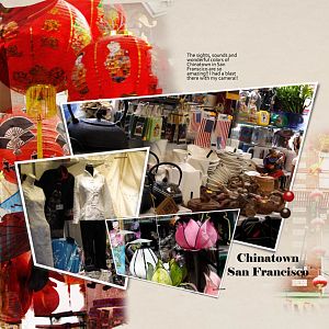
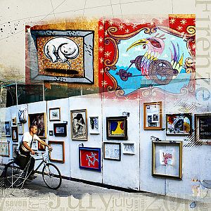
The lanterns in the background complete the design. It lets the other photos pop. Beautiful layout. Love all of the colour. The only other comment I would make is about the text in the upper right part of the page. For me I would like it to fill that white space more but I would also like it to be faded in or to use a softer colour for the text so you can still read it, but let the photos tell the whole story. That's just me. It is still a beautiful page.