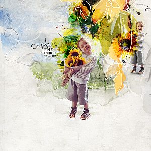
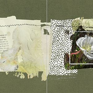
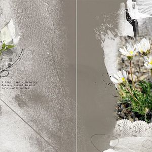
I wanted to create a page that resembled one of those beautiful art journaling pages I love so much on Pinterest. I took these photos when Autumn and I went out adventuring last April.
ArtsyLayered Template No. 251
ArtsyLayeredTemplateNo.251
ArtPlay Palette Meadow
ArtPlayPaletteMeadow
MultiLayered FotoBlendz No. 8
MultiLayeredFotoBlendzNo.8
MultiMedia Flowers No. 4
MultiMediaFlowersNo.4
Summer WordART Mix No. 1
SummerWordARTMixNo.1
MiniDots No. 1
MiniDotsNo.1
NoteBook No. 1
NoteBookNo.1
WildFlowers No. 1
WildFlowersNo.1
Take Flight No. 1
TakeFlightNo.1
Naked TapeIT No. 2
NakedTapeITNo.2
ArtsyStains No. 2
ArtsyStainsNo.2
Photos: Mine
Font: DJB Scruffy Angel
Process Notes: I used every layer in the template, and experimented with all the wonderful stains. I always turn the visibility of the layers off except the foundation layer when I use one of Annas templates, noting where and what they are, thinking how I will use them or not. This takes away from the overwhelm. In this case, I pretty much left them where they are situated on the page including their size as I built the layout.
I brought in the png fotoblendz mask, placing it just above the background layer in the layers panel and clipped the main photo to it, duplicated it and used the Poster Edges filter. I did resize the fotoblendz to fit the overlying stains and tapes in the template better. Artsy paper 1 with the blue sky was the best fit for the foundation. I put the fotoblendz on Multiply blend mode. Turning on the visibility of the small framed photo layers, I clipped the two photos to them, which gave me the springboard to create the rest of the page.
All of the stains, textures, tape and splatter layers are above the main photo on the page. Clipping solid papers to three of the stains and using blend modes. Some stains I left as is because they added depth to the background paper. Since papers and photos are different in each layout, there isnt a set recipe for any of this, nor is it a fluid process. It just takes some playing around and some fun surprises happen.
Using several transfers from the kit I placed those on the page, one being under the main photo, tucked in at the left side and resized to cover up something that kept bothering me. I brought in the MM flowers, resizing and positioning those on the page.
Moving the title and using 4 text boxes, I brought in the poem and the stamps, then adding the notebook stamp underneath in the layers panel. Word art was tucked in a couple of places and the naked tape, grunged up, was added to the small photos. The mini dots were added flying from the white flower. That completed this layout.