Being a retired teacher, I love different styles and colors of alphabet sets. However, just as when I created bulletin boards, I struggle with getting the letters straight, When I made bulletin boards, I would often stagger the letters so it wouldn't matter if they were straight. Therefore, I tend to use fonts rather than alphabet sets. This insures me that the lettering is straight. Are there any elements you seldom use?
Oscraps
You are using an out of date browser. It may not display this or other websites correctly.
You should upgrade or use an alternative browser.
You should upgrade or use an alternative browser.
Are there items you seldom use in a kit?
- Thread starter EvelynD2
- Start date
I'm not fond of alpha either. If I feel like I have to use them for a CT, I will, but otherwise, I probably don't. Sometimes, I'll cheat and use { , & and *.  The symbols sometimes make cute elements.
 The symbols sometimes make cute elements.
That is a fantastic idea! They would make great elements! I love the patterns and styles of alphas but don't use them much. Using the symbols would be a fantastic way to incorporate them into my layout. They wouldn't be hard to place and wouldn't take up much room.I'm not fond of alpha either. If I feel like I have to use them for a CT, I will, but otherwise, I probably don't. Sometimes, I'll cheat and use { , & and *.The symbols sometimes make cute elements.
They really make cute elements! If the alpha is chunky, even better! ! is fun to use, too. I'll use numbers a lot, too - I forgot to add that. I'll often use them to put a date on my page. I have such a hard time lining them up. If I try to make them "wonky", I usually don't like that either.That is a fantastic idea! They would make great elements! I love the patterns and styles of alphas but don't use them much. Using the symbols would be a fantastic way to incorporate them into my layout. They wouldn't be hard to place and wouldn't take up much room.

Not a fan either, though alighning the characters is not a complicatd thing. What I hate is handling each letter individually... just too much work and if I want to change style/font/color - it's just too much work..
I have a love-hate relationship with brushes. I'd use them if they are colored and I love those... but I will rarely - if ever - use the black ones - yes, I know I can recolor or clip papers to them - and I do know how to do it... for some reason brushes are just not my thing...
I have a love-hate relationship with brushes. I'd use them if they are colored and I love those... but I will rarely - if ever - use the black ones - yes, I know I can recolor or clip papers to them - and I do know how to do it... for some reason brushes are just not my thing...
I used to feel that way about alphas but I’ve come to really like them. With Photoshop I get an indicator line showing how they line up as I place them on the page.
I want brush sets to include both color and black so I can get the most out of them.
I tend to skip preshadowed elements because I don’t have the shadow angle information.
I want brush sets to include both color and black so I can get the most out of them.
I tend to skip preshadowed elements because I don’t have the shadow angle information.
Buttons.
Don't like 'em in real life, don't like 'em digitally. Yuck
Don't like 'em in real life, don't like 'em digitally. Yuck
Oh … you mean the PNGs that come with brushes? Because the brushes themselves are the .abr file that you load into Photoshop or PSE and must be black. You choose a color and then stamp them like rubber stamps. The PNGS are provided for those that don’t use Adobe products or who want to make them multicolored. Or am I misunderstanding you?Not a fan either, though alighning the characters is not a complicatd thing. What I hate is handling each letter individually... just too much work and if I want to change style/font/color - it's just too much work..
I have a love-hate relationship with brushes. I'd use them if they are colored and I love those... but I will rarely - if ever - use the black ones - yes, I know I can recolor or clip papers to them - and I do know how to do it... for some reason brushes are just not my thing...
Thank you so much for clarifying this, Vicki! I am not as experienced with using brushes. I will have to do some experimenting!Oh … you mean the PNGs that come with brushes? Because the brushes themselves are the .abr file that you load into Photoshop or PSE and must be black. You choose a color and then stamp them like rubber stamps. The PNGS are provided for those that don’t use Adobe products or who want to make them multicolored. Or am I misunderstanding you?
Oh … you mean the PNGs that come with brushes? Because the brushes themselves are the .abr file that you load into Photoshop or PSE and must be black. You choose a color and then stamp them like rubber stamps. The PNGS are provided for those that don’t use Adobe products or who want to make them multicolored. Or am I misunderstanding you?
exactly what I meant Vicki! I know about importing brushes, .abr files can be imported into Affinity too, but as has been mentioned above, the previews are tiny so I prefer PNGs as they are easier to manipulate, but they would be my least favorite items in a kit. Some designers include colored versions as stamps - those I love...
Generally, I find that using brushes - because of all the possibilities they offer - requires one to see/imagine the final result in their mind's eye while for me it is mostly trial and error... I'm always flabbergasted at what marvels others can create usig brushes only...
Kythe
Well-Known Member
As I don't often put a title on my pages alphas don't get used very often. I do like the Idea of using them as elements. (Check out some of Challenge 1 for how alphas have been used this way.)
Flourishes, silhouettes and strings/doodles aren't my jam either although I have been known to use a flourish with with a bevel to add to a border cluster.
Flourishes, silhouettes and strings/doodles aren't my jam either although I have been known to use a flourish with with a bevel to add to a border cluster.
I love alphas, but don't use them as often any more because I have some fantastic fonts. Shadowed elements are not my favorite. As was already stated, getting the angle, etc on my own shadows is often impossible to match. I use flowers but I am not a huge flower fan unless they are hand drawn. I have sons so I need more masculine items although I've loaded LOs when flowers when it feels right. I love hand drawn anything.
What I use the least of are heavily patterned papers unless they are abstract or sometimes geometric. I just can't make them look right - to me, at least. They distract from the focus of the LO.I prefer lightly patterned or patterns that read more as solids. I also seldom use just flat solids. I almost always texture them or use them to blend over patterned paper to tone the pattern down. That doesn't mean I don't use them - I do - but they are not my favorite.
What I use the least of are heavily patterned papers unless they are abstract or sometimes geometric. I just can't make them look right - to me, at least. They distract from the focus of the LO.I prefer lightly patterned or patterns that read more as solids. I also seldom use just flat solids. I almost always texture them or use them to blend over patterned paper to tone the pattern down. That doesn't mean I don't use them - I do - but they are not my favorite.
This is such an interesting thread!
Evelyn, try this with your alpha.Being a retired teacher, I love different styles and colors of alphabet sets. However, just as when I created bulletin boards, I struggle with getting the letters straight, When I made bulletin boards, I would often stagger the letters so it wouldn't matter if they were straight. Therefore, I tend to use fonts rather than alphabet sets. This insures me that the lettering is straight. Are there any elements you seldom use?
1. Drag your letters onto your page (don't resize yet), if you need a double letter, go to the layer with letter and hit CTRL+J to duplicate that layer (letter).
2. Once you have all of your letters, highlight all of the layers and resize the alpha to suit your page or space that the title needs to sit in.
3. Deselect the layers by clicking on another different layer somewhere.
4. Click on the first letter of your word and move it (roughly) to where you think you will want to create your title (don't be exact you can fix it later).
5. Then click on the last letter layer and move it to where you want the title to end (approx.), and roughly move the other letter layers so they are spelling out the word you want.
6. Now select all of the letter layers again and use the Bottom alignment tool (below) to create a straight bottom edge, and then,

Then use the Distribute Spacing tool to create an even spacing between the letters.
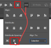
At this point I normally Group these layers together so I can move the title around as one object, resize if I need to and apply shadows etc. However, instead of just grouping these layouts, if you are sure you will not make any more changes to any of the letter layers, then go ahead and merge them into one entity and then play around with resizing and drop shadows.
I don't use templates very often at all, and when I do, I end up changing them so much that they don't look anything like what they started off to be. If I need to work with a template for CT work however, I am very careful to try and keep the original look, but it takes a lot of concentration on my part, not to run off on a different design tangent!! 

This is at least the second thread I have read recently where people dislike or don't typically use abr/brush files. I am a little surprised that I am that far out of the norm (at least in this case  )
)
There are only a few pages I make where I don't use brushes- either as stamps, erasers, texturizing, coloring or on layer masks. I use CS5 so I can't use a lot of the brushes that are larger than 2500 px so I will go through and resize all of the pngs and load them as new brushes, then save them as abrs that I can work with.
Maybe I am more than a little bit of an odd duck.


Quack quack. Lol. I’m with you. Maybe it’s my style of art because I can’t imagine life without brushes. I have over 3000 .abr files on my Mac!This is at least the second thread I have read recently where people dislike or don't typically use abr/brush files. I am a little surprised that I am that far out of the norm (at least in this case)
There are only a few pages I make where I don't use brushes- either as stamps, erasers, texturizing, coloring or on layer masks. I use CS5 so I can't use a lot of the brushes that are larger than 2500 px so I will go through and resize all of the pngs and load them as new brushes, then save them as abrs that I can work with.
Maybe I am more than a little bit of an odd duck.

Great Ducks Quack Alike!Quack quack. Lol. I’m with you. Maybe it’s my style of art because I can’t imagine life without brushes. I have over 3000 .abr files on my Mac!

I also like abr brush files. So I guess I'm on the weird side with you. I do wish you could get bigger previews in Photoshop. I would probably love them even more if I had larger previews.This is at least the second thread I have read recently where people dislike or don't typically use abr/brush files. I am a little surprised that I am that far out of the norm (at least in this case)
There are only a few pages I make where I don't use brushes- either as stamps, erasers, texturizing, coloring or on layer masks. I use CS5 so I can't use a lot of the brushes that are larger than 2500 px so I will go through and resize all of the pngs and load them as new brushes, then save them as abrs that I can work with.
Maybe I am more than a little bit of an odd duck.

Just depends on your software program I think Diane, in CC Photoshop all you need to do is just drag the .abr file from your Explorer and drop it in the Brushes panel, the same for pattern, shapes, styles etc. It's super easy to do it these days. Not sure with Elements whether you can just drag and drop or else have to go through the Preset Manager, maybe someone with the later versions of Elements can chime in?Isn't it a lot of extra work to load the .abr files first?
lazy scrapper asking?
