Oscraps
#tips & tricks challenge
-

Tips and Trick Challenge.jpg
As Karen Shultz indicates in the tutorial, brushes can be used in many ways. In this layout I combined two of Jopke's Edge Brushes to give the wood background some darker areas. Then I used Vicki Robinson's texture brushes as an eraser to remove some of the wire and to grunge up the title.- Kythe
- Media item
- #cheeryo #easter #karen schulz designs #tips & tricks challenge featured products
- Comments: 4
- Category: Oscraps Cheery O's
-

Blending Mode Challenge Karen-Schulz Feb 2022
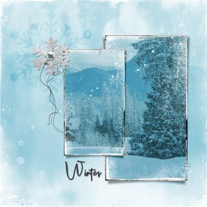
Lots of fun & experimentation with blending modes. Ultimately settled on my usual blending modes. Added colour fill over watercolour overlay & set blending to screen, 100% opacity. Clipped photos to framed masks, clipped colour fill to photo & set blending to overlay, 67% opacity. Set blending...- KimPay
- Media item
- #karen schulz designs #tips & tricks challenge
- Comments: 2
- Category: Karen Schulz Designs