Oscraps
Search results
-

Comment by 'Petra from NL' in media 'Pointe du Blaire 03'
What a lovely and creative idea! I really like the horizontal orienation of this layout. Would make a great card.- Petra from NL
- Gallery comment
-
Comment by 'Petra from NL' in media 'AnnaLift - easter in spring'
I like how you added some pink, very subtle, a soft touch of a different colour. Then I also like the darker 'tag' in the top right corner, making sure it doesn't get too sweet. And thirdly I like the horizontal line you created with the wordart and the stitching.- Petra from NL
- Gallery comment
-
Comment by 'Petra from NL' in media 'birthday'
Great details in your pictures.- Petra from NL
- Gallery comment
-
Comment by 'Petra from NL' in media 'April Camera Corner : Fennel.'
Love the contrast between the clean crisp fennel and the softer background papers. And I agree, a whole set as kitchen art would be great.- Petra from NL
- Gallery comment
-
Comment by 'Petra from NL' in media 'Family Day~AnnaLift/Sale'
LOVE the colours and the design. I would never have thought of using those brushes in black, must try that one day.- Petra from NL
- Gallery comment
-
Comment by 'Petra from NL' in media 'Yesterday'
Love the blending and the light in the image on the left.- Petra from NL
- Gallery comment
-

Guilin - travelpage
A picture taken in the south of China. Journaling talks about how differently DH and I take travelpictures. He often focuses on the sites whereas I try to spot bits of local life. I tried adding more colour and more artsy stuff but in the end decided for a rather quiet layout. Credits...- Petra from NL
- Media item
- Comments: 12
- Category: Anna Aspnes
-
Comment by 'Petra from NL' in media 'AnnaLift041312 - madagascar'
Love the light feel of this page, must be the sunny yellow and the light subtle font and colour for the journaling.- Petra from NL
- Gallery comment
-
Journaling Cards??
Would this be of interest to you?? http://annaaspnes.typepad.com/anna/2012/04/tutorial-using-artsykardz-in-digital-layouts-no-2.html- Petra from NL
- Post #2
- Forum: Chatter
-
Comment by 'Petra from NL' in media 'O collab - evOlution'
Love this! Great colours, lovely design leading our eye right to your photo, even though you might not like that ;-).- Petra from NL
- Gallery comment
-
Comment by 'Petra from NL' in media 'Robotastic'
Great extraction! So much depth with all those elements.- Petra from NL
- Gallery comment
-
My sister's daughters - retake
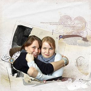
I asked for tips when I posted my 1st version of this layout. Vivre sent me a PM and suggested a few changes: 1. Make all items smaller. 2. Add a loopdaloop to tie the pearls/circles together. 3. Move the wordart further down. I added another text overlay from the same ArtPlay Palette.- Petra from NL
- Media item
- Comments: 12
- Category: Anna Aspnes
-
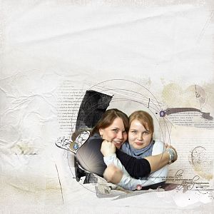
My sister's daughters
I struggled with this one. Kept adding and deleting items. Any tips are welcome. Credits: Anna Aspnes ArtPlay Palette Family Pearls/Staples/Tape: all part of Jazzedup Loopdaloops Other designers Edge overlay: KPertiet Hearts: Taylormade- Petra from NL
- Media item
- Comments: 12
- Category: Anna Aspnes
-
Comment by 'Petra from NL' in media 'then'
Great page! Subtle yet effective embellishments. Love what you did to the picture itself, did you use a blending mode making all sorts of things to show through?- Petra from NL
- Gallery comment
-
Comment by 'Petra from NL' in media '2012 - wk 15'
Love that picture of the button sewing too! First of all that you even thought of taking this photo, secondly because it has such soft grey tones. Is that why you did the easter eggs in B&W?- Petra from NL
- Gallery comment
-
Comment by 'Petra from NL' in media 'oui, je le veux!!'
That cluster is amazing!- Petra from NL
- Gallery comment
-
Comment by 'Petra from NL' in media 'spring blossoms'
Nice contrast between the vertical fotowallets and the horizontal strips in the background paper. The butterflies are a great additon, very soft feel.- Petra from NL
- Gallery comment
-
Comment by 'Petra from NL' in media 'spring'
Love the softness of the picture surrounded by less friendly colours in the background. Makes the flowers pop.- Petra from NL
- Gallery comment
-
Comment by 'Petra from NL' in media 'The Flying Horses'
Lovely page, you captured the feel of the era.- Petra from NL
- Gallery comment
-
Comment by 'Petra from NL' in media 'beyond'
Nice horizontal line and such lovely pictures again.- Petra from NL
- Gallery comment