Oscraps
Search results
-
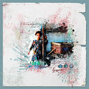
Egypt - older photo
An older photo from my trip to Egypt back in 1999. Anna Credits: APP Festive - blueish paper Scripttease Remember Frame LoopdaLoop Jazzed Up No 1 APP Crazy Life - brads APP Winter2 - staples Other Credits: Miss Mint Papers Stressed Out Neutral 1 - white paper A few papers from...- Petra from NL
- Media item
- Comments: 9
- Category: Anna Aspnes
-

Comment by 'Petra from NL' in media 'Artisans - Anna Lift'
This page conveys just the right feeling for an Artisans page. The fotoglow adds a little sparkle.- Petra from NL
- Gallery comment
-
Comment by 'Petra from NL' in media 'Tulips'
Love how the colour of the tulips is reflected in the background, be it a little softer. Nice!- Petra from NL
- Gallery comment
-
Comment by 'Petra from NL' in media 'photo Vitalis 25 11 12'
What a sweetie! I really like that piece of tape with the lettering.- Petra from NL
- Gallery comment
-
Comment by 'Petra from NL' in media 'I'm a Pepper! (AnnaLift 11-23-12)'
Love those sprinklez, like the fizz in the drink. Such happy colours!- Petra from NL
- Gallery comment
-
Comment by 'Petra from NL' in media 'A Brother's Love'
Love how you blended/combined the papers. The sketchy lines provide such great white space as well as direction to the page. Lovely shadow on the ribbon and I also like the subtlety of the brads going off the page.- Petra from NL
- Gallery comment
-
Comment by 'Petra from NL' in media 'DO YOU BELIEVE'
GREAT page!! Love what you did with the wings and the pops of light in the background.- Petra from NL
- Gallery comment
-

Retake - softer style
A remake of the Booster layout. This time using softer elements, mostly from Anna's APP Blossom. Text frame from the ScriptTease Remember frames. On the left I merged 2 ArtsyKardz Adventure (recoloured) and added a gradient. It just adds some colouring now.- Petra from NL
- Media item
- Comments: 12
- Category: Anna Aspnes
-

Blending Booster nbr 1
I started a short online class yesterday: Blending&Beyond the Booster workshop by Jana Morton. She showed a sketch technique which I slightly modified by adding the watercolour technique found here in the forum. Anna Credits: Red paper: Anna Red Solid as received in the...- Petra from NL
- Media item
- Comments: 13
- Category: Anna Aspnes
-
Comment by 'Petra from NL' in media 'Autumn Sunrise'
Such gorgeous colours! Love them! I like the subtle edge and the watercolour effect near the bottom right is great. Was that the transfer or did you do it yourself?- Petra from NL
- Gallery comment
-
Comment by 'Petra from NL' in media 'A Golden Hour'
I am in AWE of your gorgeous shots! That photostrip really completes the page, the small one on the right is my favourite.- Petra from NL
- Gallery comment
-
Comment by 'Petra from NL' in media 'A Bold Fall'
So much texture in that photo, love it! I'm trying to work out where you used that warm glow, possibly on the cluster? My favourite part: the sketched leaf near the bottom and the loopdaloop. I would never have thought of using a loopdaloop on this layout but it definitely grounds and connects...- Petra from NL
- Gallery comment
-
Comment by 'Petra from NL' in media 'Boys Will Be Boys'
LOVE the storyboard. The fact that you carried one of the photos onto the other side is something I never would have thought of myself but will definitely keep in mind. It provides so much connection, especially with the leaves leading the eye. The first B with the wood structure complements the...- Petra from NL
- Gallery comment
-
Comment by 'Petra from NL' in media 'Pumpkin'
What a great effect on those letters! The big pumpkin looking on it is a great find as well. I also like the contrast between the rather bold letters and the soft bsckground.- Petra from NL
- Gallery comment
-
Comment by 'Petra from NL' in media 'Pony Ride'
I really like all the white space and the repetition of the leaves and that rugged edge. The ribbon works very well with this photo.- Petra from NL
- Gallery comment
-
Comment by 'Petra from NL' in media 'summer'
Love those stitches on the horizon! I'm amazed at all the different elements you choose to use, do you ever call it done?- Petra from NL
- Gallery comment
-
Comment by 'Petra from NL' in media '2012 - wk 32'
I like Sjef Jacobs too!- Petra from NL
- Gallery comment
-
Comment by 'Petra from NL' in media 'Together'
GREAT blending! LOVE the soft background picture which goes with the feeling of the background paper with all those soft colours. The brighter colours in the other picture make sure the page isn't too soft/cutesy for a boys page. Lovely lovely work, standing O well deserved!- Petra from NL
- Gallery comment
-
Comment by 'Petra from NL' in media 'A Door for Anna's Lift'
LOVE how you left just a few bricks in colour and used the rest as a lovely backdrop for the sketchy foliage. NICE!- Petra from NL
- Gallery comment
-
Comment by 'Petra from NL' in media 'In My Garden...Anna Lift'
Lovely collection of shots. I like that you used black to add some contrast and 'power' to a page with such soft colours. My Salvia is a lot darker...- Petra from NL
- Gallery comment