Oscraps
Search results
-

Comment by 'Jam-on-toast' in media 'Paris Arts.jpg'
LOVE your series! Very creative!!!- Jam-on-toast
- Gallery comment
-

Hello from Sunny Sussex
Hello and big WELCOME!!! Have jsut had a look at your layouts - STUNNING!!!!- Jam-on-toast
- Post #19
- Forum: Introduce yourself!
-

YouTube Tutorials?
I must admit I am one of those who LOVE playing and creating with my software - the actual process of clicking and dragging etc... I've learned a number of things, from the basic odd-shaped text boxes that I use in practically every layout to curved photo frames and building a realistic notebook...- Jam-on-toast
- Thread
- Replies: 6
- Forum: Scrap Chat
-

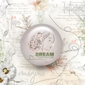
Dream
I started this layout with a vague idea that I wanted to follow one of YouTube tutorials and create a shere from scratch. I wasn't entirely happy with my efforts - tweaking shadows is harder than it looks- and decided I needed something... to make it look shiny... hence the water drops graphics...- Jam-on-toast
- Media item
- #anna aspnes designs #art journaling #cheeryo et designs
- Comments: 6
- Category: Oscraps Cheery O's
-

Comment by 'Jam-on-toast' in media 'Better Together'
Great photo! Love the tilted page design and the delicate cluster all around it.- Jam-on-toast
- Gallery comment
-

Comment by 'Jam-on-toast' in media 'TheWayToTheSea.jpg'
Oh, I love this layout! The cluster-not-really-cluster on the right is fantastic, and the boots are great too!- Jam-on-toast
- Gallery comment
-

Comment by 'Jam-on-toast' in media 'Fireflies and Fairy'
Fascinating... Love the glass effect... where did you get the bowl?- Jam-on-toast
- Gallery comment
-

Hello again
Glad to have you here... Been loving your layouts for a while...- Jam-on-toast
- Post #31
- Forum: Introduce yourself!
-

Collect your FREE download | Right Now - Mixed Media Kit
Amazing freebie! Thank you!!!- Jam-on-toast
- Post #7
- Forum: O So Happy
-

How do you stay organized?
I have year folders 2020, 2021 etc... and name my layouts '01-02, trip to..' means january-layout2- place ... so a quick look at the preview is enough...- Jam-on-toast
- Post #3
- Forum: Scrap Chat
-

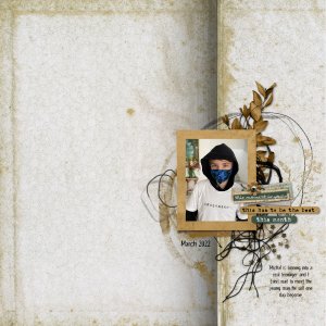
Has to Be the Best
White space challenges are hard for me, so I tend to use a template to get me started. This time I used one of the white space templates by Rachel Jefferies who has recently joined Oscraps as a designer. I was so excited I couldn't wait to play with her goodies... Can you blame me?- Jam-on-toast
- Media item
- #cheeryo #rachel jefferies challenge #5 white space challenge.
- Comments: 5
- Category: Challenge 5
-

Hi from the UK :)
Welcome!! So excitd you are here!!! I've been a huge fan of your for a while now!!!- Jam-on-toast
- Post #30
- Forum: Introduce yourself!
-

"So Much" by Lynn Grieveson
I'm currently being overwhelmed by the joy I'm feeling that you are here.. I love this So Much collection so much! Those colors are just divine!!!- Jam-on-toast
- Post #9
- Forum: ==> What's new at the O
-

Comment by 'Jam-on-toast' in media 'No12.46566578356236.jpg'
The hat is epic!- Jam-on-toast
- Gallery comment
-

Comment by 'Jam-on-toast' in media 'Enjoy The Rain.jpg'
Oh, I love the journlaing on a path! What a great moment to scrap!- Jam-on-toast
- Gallery comment
-

Comment by 'Jam-on-toast' in media 'dear past, thank you for the lessons'
Awesome photoless layout! Love the color combo and so totally agree with the sentiment!- Jam-on-toast
- Gallery comment
-

Comment by 'Jam-on-toast' in media 'Love'
Excellent use of white space! And an awesome moment to scrap!- Jam-on-toast
- Gallery comment
-

Comment by 'Jam-on-toast' in media 'Frida.jpg'
Frida is quite a character... and your page captures her perfectly.- Jam-on-toast
- Gallery comment
