Oscraps
Search results
-

Comment by 'Jam-on-toast' in media 'Christmas'
Love the simplicity of your page that lets me focus on your precious photo. From 1920!- Jam-on-toast
- Gallery comment
-

Comment by 'Jam-on-toast' in media '22-11_natali_22_18_gratitude'
Love that wordart you used! Fabulous white-space layout!- Jam-on-toast
- Gallery comment
-

Comment by 'Jam-on-toast' in media 'Happy Today'
What a fun page, Eva! I really love the scatter you created!- Jam-on-toast
- Gallery comment
-

Comment by 'Jam-on-toast' in media 'When winter comes'
Sonja, I love your notebook layouts! So deceptively simple and oh so totally beautiful!- Jam-on-toast
- Gallery comment
-

Comment by 'Jam-on-toast' in media 'Tomorrow'
Oh, I totally dig the string connecting your side clusters!- Jam-on-toast
- Gallery comment
-

Comment by 'Jam-on-toast' in media 'All the Little Joys'
Gorgeous wreath! I've become rather partial to wreaths recently... Your clustering is amazing!- Jam-on-toast
- Gallery comment
-

Comment by 'Jam-on-toast' in media 'Husband & Sister walking through giant crystals.'
Wow... I love how you combined art from so many designers to create your unique page! Your layout encouraged me to google what a stupa is... and I went down the rabbit hole from there... What fun! Thank you for sharing your page with us!- Jam-on-toast
- Gallery comment
-

Creativity takes … courage?
... been there done that... can totally relate... trying is fun... but Pinterest fiasco is all too real... thank you for sharing!- Jam-on-toast
- Post #3
- Forum: Chatter
-

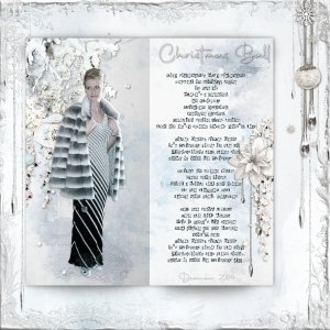
Christmas Ball 2004
One of the things I LOVE doing is playing with shadows - couple of blurred ovals placed under a rectangle can work miracles! Add on top another rectangle with linear transpacency applied - and you got yourself a neat custom-made notebook. Thank you for looking.- Jam-on-toast
- Media item
- #cheeryo #magical reality designs travelers notebook
- Comments: 3
- Category: Oscraps Cheery O's
-

Comment by 'Jam-on-toast' in media 'Attitude of Gratitude Day 22 - Weather/Neighbors'
I enjoyed reading your journaling... I agree, it's a shame we don't seem to talk to people anymore because we are all so busy... beautiful page!- Jam-on-toast
- Gallery comment
-

Comment by 'Jam-on-toast' in media 'Life is short'
Wow... this made me wonder what the photo was of... great use of wordart!- Jam-on-toast
- Gallery comment
-

Comment by 'Jam-on-toast' in media 'November Challenge #4 - Multi Photo'
Wow... great extraction and I really dig the plain white background! That wordart is awesome! I need to check out the kit!- Jam-on-toast
- Gallery comment
-

Comment by 'Jam-on-toast' in media 'Anna Lift - Like Branches on a Tree - Kinsfolk'
Wonderful page... Love the splash of color!- Jam-on-toast
- Gallery comment
-

Comment by 'Jam-on-toast' in media 'Master-Custom-Blending-VT-Cows'
Gorgeous photo... love your title work!- Jam-on-toast
- Gallery comment
-

Comment by 'Jam-on-toast' in media 'Tales OF Winter'
Oh, this makes me miss snow so much....- Jam-on-toast
- Gallery comment
-

Comment by 'Jam-on-toast' in media 'Tales O Winter'
Oh, this looks like the cover of a book - something cozy and romantic that I would read curled up in an armchair with a cup of hot cocoa in hands and the book on my lap. A shapeshifter/vampire novel perhaps, because her shoes are so totally inappropriate for the walk... Very lovely scene!- Jam-on-toast
- Gallery comment
-

Comment by 'Jam-on-toast' in media 'a dream within a dream'
There are layers within layeres here...And the most I look at your page, the more I see and the more my mind wonders off in about a million different directions... Well done!- Jam-on-toast
- Gallery comment
-

Comment by 'Jam-on-toast' in media 'Black Widow'
What a great Halloween-themed page! It made me think of a Cinderella - just a tad bit angry and with plenty of determined sticking her finger into a pumpkin as if saying 'whatever it takes to get out of here'.- Jam-on-toast
- Gallery comment
-

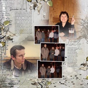
The Mists of Nostalgia 2
And the left-hand-side to my double pager documenting December 2008. I am not sure if MagicalReality Designs' products were meant to be used this way, but there were sure fun to work with. Thank you for looking.- Jam-on-toast
- Media item
- #cheeryo #magical reality designs #watercolor anna aspnes template
- Comments: 3
- Category: Oscraps Cheery O's
