Oscraps
Search results
-

Comment by 'musicmom3' in media 'AASPN_ArtPlayPaletteGlacial.jpg'
One word--stunning!- musicmom3
- Gallery comment
-

Comment by 'musicmom3' in media 'anna-aspnes-digital-scrapbook-artplay-routine-value-pack-pam-2-.jpg'
Pretty! Loving the slightly abstracted look here!- musicmom3
- Gallery comment
-

Comment by 'musicmom3' in media 'Anna-Aspnes-digital-scrapbook-Oscraps-Challenge-3-Maple-Suga4-Joan.jpg'
Love the details that accompany the overview of the shack! Nice glow to this layout, too.- musicmom3
- Gallery comment
-

Comment by 'musicmom3' in media 'Noël 2023 n°3 copie.jpg'
Love all the red!- musicmom3
- Gallery comment
-

Comment by 'musicmom3' in media 'Challenge #3_Through the lens_Ladybugs Club Meeting.jpg'
Love the closeup in contrast to the group shot so you can see the popularity of this meeting place! In New York we get big groups every so often too!- musicmom3
- Gallery comment
-

Comment by 'musicmom3' in media 'Cold Palms'
First palms of the season! As wonderful to see as always, even if it's sweatshirt weather for you guys.- musicmom3
- Gallery comment
-

Comment by 'musicmom3' in media 'Project 2023 P40 - Another Typical Adventure'
A true labor of love--and each spread is so artfully done. What a project!- musicmom3
- Gallery comment
-

Comment by 'musicmom3' in media 'Total White'
Beautiful and very creative use of the Glacial digital supplies!- musicmom3
- Gallery comment
-

Comment by 'musicmom3' in media 'Noël 2024 n°4'
Beautiful! Frosty, festive, and perfect!- musicmom3
- Gallery comment
-

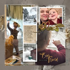
Windows On His World
Lately the hue/saturation in Photoshop Elements (I use version #14) has been a lifesaver. As I was finishing up this FotoInspired layout, I really liked the look of the leafy multimedia element from the Hygge collection, but the bright green just did not work with the muted gold tones of the...- musicmom3
- Media item
- Comments: 13
- Category: Anna Aspnes
-

Comment by 'musicmom3' in media 'Lyme Regis, Dorset'
Love those wintry skies!- musicmom3
- Gallery comment
-

Comment by 'musicmom3' in media 'Anna Aspnes Colour Challenge - Chilly Sunrise'
Beautiful view, beautiful layout!- musicmom3
- Gallery comment
-

Comment by 'musicmom3' in media 'anna-aspnes-digital-scrapbook-month-review-template-album-diane-ozweek.jpg'
Love your comment about the "week in review," instead of the monthly summary. Your photos carry all the important memories.- musicmom3
- Gallery comment
-

Comment by 'musicmom3' in media 'Project 2023 P38 - Smile Because it Was'
The four birds over the photo of the four kids drew me in instantly. You are speeding through this album and it is a treasure! The embellishments on the frame give you-at-the-piano just enough distance from the more formal photos--a clever solution.- musicmom3
- Gallery comment
-

Comment by 'musicmom3' in media 'First Snow'
I actually fiddled around with hue/saturation to turn that baby hat from green to orange.... Overthinking much? LOL- musicmom3
- Gallery comment
-

First Snow
This is a blended layout, with the photo and two duplicates blended directly into the background paper (Artsy Paper #1), so I made good use of the blending brushes in this set. I added the frames and some artistry layers from the template, and then added Artsy Transfers to spread more color and...- musicmom3
- Media item
- Comments: 7
- Category: Anna Aspnes
-

Comment by 'musicmom3' in media 'A slow start'
I notice the face blur--are you doing that routinely? I am debating adopting that because the use of AI has added yet another dimension to internet image pirating. (Cool layout, and yes, Colin should have listened to you....)- musicmom3
- Gallery comment
-

Comment by 'musicmom3' in media 'wild roses in winter - aAcolor 12.1.-8.2.2024'
This feels wistful, almost dream-like, a paean to roses past. So lovely.- musicmom3
- Gallery comment
-

Comment by 'musicmom3' in media 'anna-aspnes-digital-scrapbook-artplay-value-pack-routine-pam-1.jpg'
I like how contained this feels. There's lots of line and color, and it contrasts nicely with the restraint in this design.- musicmom3
- Gallery comment
-

Comment by 'musicmom3' in media 'Project 2023 P36 - So Long 'Big-D' Dallas'
The fashion! Well captured! And congrats on the standing O!- musicmom3
- Gallery comment
