Oscraps
Search results
-

Comment by 'Kythe' in media 'Challenge#1_March_Web Inspiration.jpg'
How brilliant is this! I adore Mother Rabbit all gussied up and Mr. Fox waiting in the background. Super addition!- Kythe
- Gallery comment
-

March Challenge # 1 - Web Inspiration
How brilliant is this! I adore Mother Rabbit all gussied up and Mr. Fox waiting in the background. Super addition!- Kythe
- Post #41
- Forum: MARCH 2023 CHALLENGES
-

Comment by 'Kythe' in media 'March-Challenge---Web-Inspiration'
Wow, he is magnificent and totally in control! The shoes are definitely something not to get to close to. Wonderful addition to the challenge.- Kythe
- Gallery comment
-

March Challenge # 1 - Web Inspiration
Wow, he is magnificent and totally in control!- Kythe
- Post #38
- Forum: MARCH 2023 CHALLENGES
-
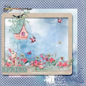
Simply Spring 02.jpg
- Kythe
- Media item
- #cheeryo #oscraps collabs #spring
- Comments: 2
- Category: Oscraps Cheery O's
-

Simply Spring 01.jpg
- Kythe
- Media item
- #cheeryo #oscraps collabs #spring
- Comments: 2
- Category: Oscraps Cheery O's
-
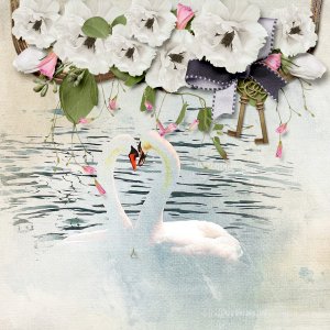
Together 02.jpg
- Kythe
- Media item
- #cheeryo #palvinka designs
- Comments: 0
- Category: Oscraps Cheery O's
-
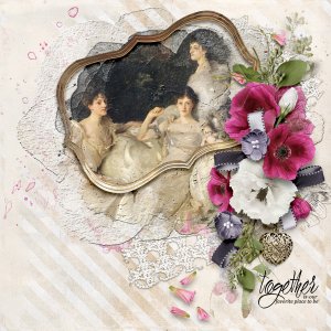
Together.jpg
- Kythe
- Media item
- #cheeryo #clusters #palvinka designs
- Comments: 0
- Category: Oscraps Cheery O's
-

One Zee 22.jpg
It is great fun combining background builders to create a scene.- Kythe
- Media item
- #fantasy #foxeysquirrel
- Comments: 1
- Category: Foxeysquirrel
-

March Challenge # 1 - Web Inspiration
Fabulous! I really like the way you have positioned the lettering. He really looks like he is enjoying his hike. Love this. @faerywings Oh come on you! Sure you can do a good job. Give it a try.- Kythe
- Post #36
- Forum: MARCH 2023 CHALLENGES
-

Comment by 'Kythe' in media '23-03_O_March-Challenge-#-1---Web-Inspiration'
Fabulous! I really like the way you have positioned the lettering. He really looks like he is enjoying his hike. Love this.- Kythe
- Gallery comment
-

March Challenge # 1 - Web Inspiration
:giggle4: I love it! The cartoon look is quite funny. Thanks for showing another way of interpreting the challenge.- Kythe
- Post #31
- Forum: MARCH 2023 CHALLENGES
-

Comment by 'Kythe' in media 'March-Challenge-#1-Web-Inspiration_Trust-the-Magic2'
I agree. The sketch portion really adds to the overall composition. The white background and faded out image is really effective.- Kythe
- Gallery comment
-

Comment by 'Kythe' in media 'Raven Haired'
Absolutely it is okay to switch. I wondered if any one would. I love this take.- Kythe
- Gallery comment
-

March Challenge # 1 - Web Inspiration
Oh my 2! I can't decide which I like better. They are both so good! I wonder what 'Miss Kitty' is up to? Absolutely it is okay to switch. I wondered if any one would. I love this take.- Kythe
- Post #30
- Forum: MARCH 2023 CHALLENGES
-

Comment by 'Kythe' in media 'March-Challenge-#1-Web-Inspiration_Trust-the-Magic'
Oh my 2! I can't decide which I like better. They are both so good! I wonder what 'Miss Kitty' is up to?- Kythe
- Gallery comment
-

Off side elements
I totally agree. That's why I couldn't understand the directive to not do it.- Kythe
- Post #6
- Forum: Scrap Chat
-
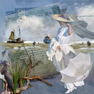
Windswept.jpg
Background starters are a great way to build a scenic page. You can bring them up to the foreground or fade them away in the distance for completely different looks. Add a background paper, mask off the parts you don't want and add the focus.- Kythe
- Media item
- #beach #foxeysquirrel #nature & outdoors
- Comments: 1
- Category: Foxeysquirrel
-
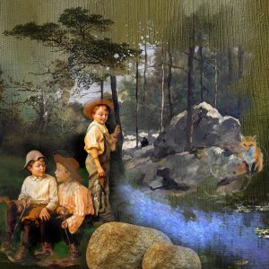
Playing Hooky.jpg
- Kythe
- Media item
- #foxeysquirrel #nature & outdoors
- Comments: 1
- Category: Foxeysquirrel
-

Comment by 'Kythe' in media 'Delirium'
Great title. The overlay of colours enhance the figure and add to the drama.- Kythe
- Gallery comment
