Oscraps
Search results
-

Comment by 'ksacry' in media 'AnnaLift-Life-is-a-journey.jpg'
Awww, what a pretty puppy! I like how you used the lace to gently caress the face of the large photo.- ksacry
- Gallery comment
-

Comment by 'ksacry' in media 'Make the World Better'
So lovely! Plus there are cookies.- ksacry
- Gallery comment
-

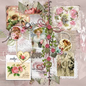
anna-aspnes-digital-art-artplay-love-value-pack-no-2-ksacry Valentine
My inspiration for doing this Valentine layout came from Anna Aspnes Design’s Love ValuePack No 2 and Vicki Robinson’s Vintage Valentine Ephemera. Construction: I started with FotoInspired Template Pack No 3A, page 7. I turned off some layers and moved some fotomasks. I added Vicki Robinson’s...- ksacry
- Media item
- Comments: 7
- Category: Anna Aspnes
-

Comment by 'ksacry' in media 'Love Note'
This reads like a Valentine card with a hand written note. Wonderful layout!- ksacry
- Gallery comment
-

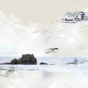
anna-aspnes-digital-art-artplay-collection-sayonara-ksacry Sea Moments
My inspiration was the minimalistic beach layout from ViVre. I couldn’t quite let myself go that minimalistic though and added birds, elements, and word art. Construction: I placed the ArtPlay Palette Chills Solid Paper #2 as the background. I placed my husband’s photo (exposure manipulated via...- ksacry
- Media item
- Comments: 9
- Category: Anna Aspnes
-

Comment by 'ksacry' in media 'Flowers...'
So lovely! I like the contrasting frames in black with the yellow flowers.- ksacry
- Gallery comment
-

Comment by 'ksacry' in media 'Butterflies'
Gorgeous! I love the beautiful softness to your layout!- ksacry
- Gallery comment
-

Comment by 'ksacry' in media 'Mathilde 02 11 22 .'
Wonderful! I love the bright multicolors of this page reflected in the MultiMedia Art palettes.- ksacry
- Gallery comment
-

Comment by 'ksacry' in media 'Snowglobe'
The extracted photo really catches my eye and draws me into the rest of the layout. Great work!- ksacry
- Gallery comment
-

Comment by 'ksacry' in media 'AnnaLift: Longs Peak'
Beautiful layout! I like the photo of the peaks at the bottom, nice touch.- ksacry
- Gallery comment
-

Comment by 'ksacry' in media 'Portrait...'
Those transfers go well with the sketch. Beautiful!- ksacry
- Gallery comment
-

Comment by 'ksacry' in media 'anna-aspnes-digital-art-artplay-collection-sayonara-jerri-sunshine-rainbows'
Such photos must be hard to capture. I love the large frame with the three small close-ups. Your minimal clusters with the word art flowing across the top of the frame is beautiful!- ksacry
- Gallery comment
-

Comment by 'ksacry' in media 'special one'
A great way to show off one big photo. Beautiful!- ksacry
- Gallery comment
-

Comment by 'ksacry' in media 'anna-aspnes-digital-art-fotoinspired-templates-3a-magoa-michelle-our-story.jpg'
I love your use of the frames in that template making for a great page over all!- ksacry
- Gallery comment
-

Comment by 'ksacry' in media 'My Dad, 1930's - Magoa'
I love how you have the single photo over the center transfers, leading left to right, but then a diversion of the elements thats leads the eye to the bottom rose. Nicely done!- ksacry
- Gallery comment
-

Comment by 'ksacry' in media 'bertha allen'
Beautiful! Love the work you did on the extended "dress".- ksacry
- Gallery comment
-

Comment by 'ksacry' in media 'Isak - AnnaLift'
I like how you matched all the coloring to the photos, yet they stand out on their own. Well done!- ksacry
- Gallery comment
-

Comment by 'ksacry' in media 'anna-aspnes-digital-art-artplay-collection-magoa-viv-heritage.jpg'
Wow, dramatic with the dark coloring and the work you did on the photo!- ksacry
- Gallery comment
