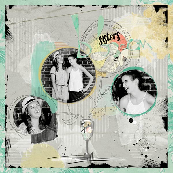
This photo was taken of my Granddaughters Autumn and Sophia by their friend Skylar and I loved the photo so much I had to do something with it. The photo shows how very close they have grown.
Flowers ValuePack No. 1
FlowersValuePackNo.1
Painted MultiFoto Layered Template No. 2
painteMultiFotoLayeredTemplateNo.2
FotoInspired EdgeTemplates No. 4
FotoInspiredEdgeTemplatesNo.4
Different Strokes No. 2 (Retired)
Artplay Palette Portiere (Splatter Brush)
ArtPlayPalettePortiere
Fonts: Amelian Script and Traveling Typewriter
Photo: Skylar Strean
Process Notes: Changing the design of the template and working with the APP Blooming Marvelous from the ValuePack, I used paper 2 for the template background, then I blended two papers together for the inside background of the template.
Adding the foto inspired edge template, resizing and rotating parts of it and situating it underneath the circles and recolored as I built the rest of the page.
I brought the photo in after making it black and white and using an action to make it contrasty, I clipped it to three of the four circle masks in the template, duplicating and resizing. I placed a transfer from the Palette to the top circle.
I created the vase from the custom shapes, clipped a solid paper to it and used the Hue/Saturation adjustment to make the paper darker. I clipped the whimsical bird transfer to it after resizing and positioning and ran an eboxy style on the vase shape layer, adjusting it a little bit. I drew the whacky branches and leaves with my pen and tablet.
From there I added more transfers, scribbles, splatters and overlays to the page it give it an artsy look.
I added the title with Amelian Script and word art from the kit. I clipped the same background paper to the word art, giving it a bevel and emboss and a small drop shadow. I also moved the stitching in the circles a little bit. Blooming Marvelous is such a fun, whimsical kit to work with.