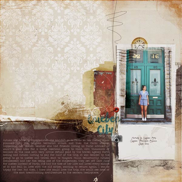
Journaling: Autumn was bitterly disappointed she couldnt go to Paris as her French class planned. With the Belgian terrorist attack and then the Paris strikes happening, her French teacher who had friends living in Paris advised, it wasnt a good idea for a large American group to visit. With thousands of dollars on the line with very little refund by the travel agency forth coming and Autumn having to pay for half of the trip, it was decided by the group to go to Quebec and travel east to Niagara Falls. Reluctantly Autumn acquiescent and her Mom being one of the chaperones, they set off last June for Quebec instead of Paris. Happily she had the time of her life and loved every minute of it and fell in love with the old cities, wanting to return again. I was so happy for her. But then, I knew she would love the trip, she would see some of the most breathtaking architecture in the western hemisphere.
September 8th twenty-four hour $5.00 ValuePack with coordinating $5.00 ArtPlay Palette Traveler
Photo: Jackie Houston Reed
Fonts: Fortunaschein, Traveling Typewriter and Manhattan Darling
Process Notes: Using artsy paper 5 as my foundation I placed the artsy gram frame and clipped the photo to the mask. I clipped the brush word art to the frame reducing the opacity and another brush along the bottom left of the frame recoloring and putting it on Linear Burn at 100% opacity. I added a transfer along the left edge and put it on Color Burn on 100% opacity as well as the overlay stains on the bottom right edge of the frame on Color Burn at 100% opacity.
Over the frame I placed the button, psd camera and button thread. I placed the clock within the frame layers and put that on Color Burn, also at 100% opacity. I typed out the caption on the frame.
Underneath the photo and frame I placed the scribble brush coming from the top of the page. In the layers panel I positioned the gold paint transfer over these layers and put it on Linear Burn at 100% opacity and over it the scribble overlay. I placed another brush from the palette below the gold paint and put it on Soft Light at 100% opacity after recoloring it from the paper.
The title was typed out with the passport stamp placed over it.
The artist edges was recolored and blended to Color Burn at 100% opacity. The journaling was added and colored from the palette. And there you have it, another layout completed.