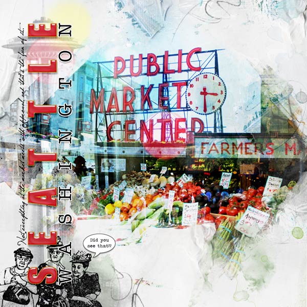
Journaling: Not everything at the market meets with approval, and thats the fun of it.
Thats the reason for the three disapproving ladies. The market is teaming with life and I love the sometimes outrages sights I can see there. I prefer the weekdays, on the weekends there are too many tourists during the summer and it takes away from the local color. Its in the heart of the city on the waterfront and used to be quite a scruffy part of town. The place is huge with many levels, a rabbit warren of deliciousness. Yes, I love the pulse of the market and if I lived closer, I could make a wonderful album of the place. And maybe, if Im very lucky, I would see Princess Angelines ghost.
ArtPlay MiniPalette Gelid
ArtPlayMiniPaletteGelid Free with $20. purchase until March 20th
12 x 12 Page FotoBlendz No. 8
12x12PageFotoBlendzNo.8
Dripped Stains No. 1 (Retired)
Bokeh No. 2
BokehNo.2
Rubber Stamp: Ken Brown Stamps
Photos: Mine and MorgueFile
Fonts: Impact, American Typewriter, Jellyka Saint-Andrews Queen
Process Notes: This is a retooled layout I did three years ago in PSE 11 and before Anna. I like the original, but I thought I would give it a new look. From the original I brought in the blended photos of the market and because I had worked long and hard in PSE 11 to create Seattle Washington I also brought those in. Every letter was created on its own layer and spaced just so then merged. Of course in Photoshop that is a lot easier. It was going to be worked into the new design come hell or high water, that was all there was to it.
After bringing in the above mentioned layers, I used solid paper 1 as my background and the page fotoblendz. I rotated the fotoblendz to make a diamond shape and clipped the blended photos of the entrance of the market and vegetable vender to it with a bit of resizing. Of course the photos were blended with layer masks, copied and blended again. Over the blended photos I clipped artsy paper 1 and blended it to Overlay.
I rotated the Seattle Washington to run up the page and decided that maybe the Space Needle would be a good vertical background for it, even though its not near the market. Placing it under the word art and blended photos in the layers panel, I brushed out the distracting buildings around it with a layers mask, desaturated it and lowered the opacity after duplicating it and putting it on Screen blend mode. I added the short line of journaling running up on the left side.
Im taking Annas advanced brush class and using one of the rubber stamps from my extensive collection, made a digital stamp of the three disapproving ladies and placed those at the base of the Space Needle adding the speech bubble from the shapes tool and typing out the verbiage.
From there I tweaked the page with transfers, overlays and brushes at the edges of the layout and to get rid of harsh edges in the photos to give a more seamless look. Finally, I added the bokeh.
Its a busy layout, but then, the market is a busy place.