Surfs up Artsy Transfers **coming Wednesday**
Artsy Layered Template #267 https://www.oscraps.com/shop/Artsy-Layered-Template-No.-267.html
Surfs up Artplay Palette https://www.oscraps.com/shop/ArtPlay-Palette-Surf-s-Up.html
Beach Mix No. 3 Word Art https://www.oscraps.com/shop/BeachWordART-Mix-No.-3.html
Also: Frame, Arrive Artplay Palette https://www.oscraps.com/shop/ArtPlay-Palette-Arrive.html
Photoshop Elements 14
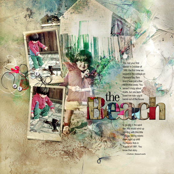
One of my projects is to salvage photos from my old paper scrapbooks and render them into a digital layout. It can be really hard, facing weird crops and sometimes I would have even written on the photos or adorned them with stickers or ephemera, so there's that to deal with.
For this layout, I swapped out the frames in the template because they were the wrong shape for my rectangular photos; I chose a replacement frame that had bit of an antique look to it since this layout is about the past, duplicated it, and used multiply blending mode to bring out the browns. I clipped in my photos (adjusting them with some levels layers), and then blended my big photo into the background.
I love these new color templates. After adding the background (Artsy paper #2 with the bottom blended away and replaced with Solid Paper #1), I didn't do much of anything else by way of stains and textures but add a little brushwork and some embellishments. I changed the word beads to say see rather than sea to better fit my theme.
To even out all the color tones in the photos (and to restore color that some of the blending modes had washed out, I added a light brown gradient layer on multiply mode. Then I dropped Artsy Transfer #1 in the middle of the layer stack, which nicely restored the brown in the blended photo and gave some additional texture to the design; the gold layers in the Artsy Transfer also restored the sand around my son's sneakers. As a last step I flattened the file and sent it through a filtering app on my phone.