Oscraps
- Credits list
-
Project Template Album No.1
Artplay Palette Bravura
ArtsyTransfers Bravura
Bravura WordART Mix No.1
MultiMedia Flowers No.5
Aubade WordART Mix No.1
Happiness WordART Mix No.1 (BeadedThreadz)
ArtPlay Palette Sirenic (Label Word)
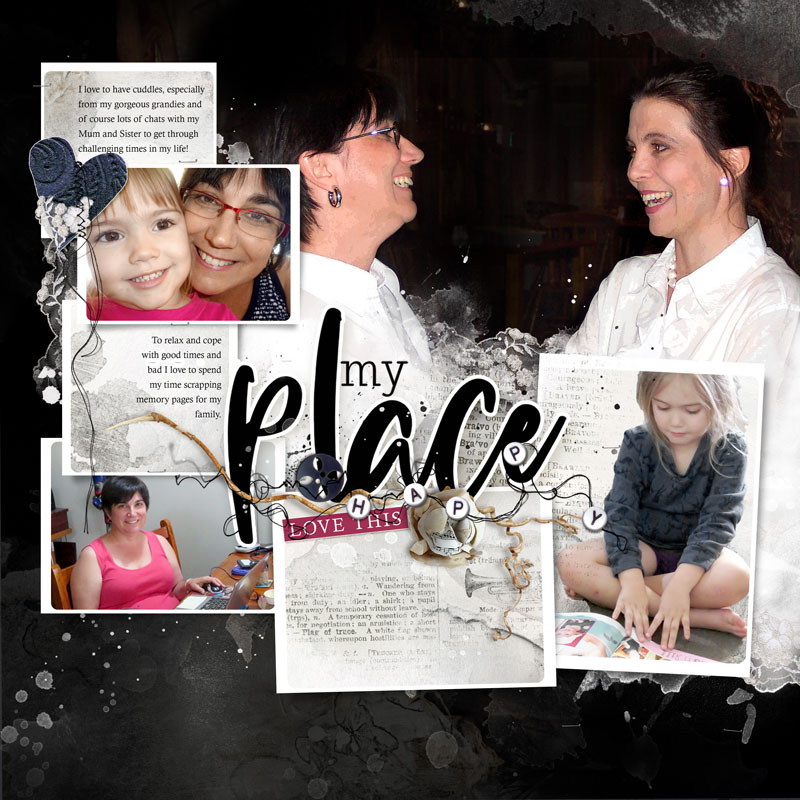
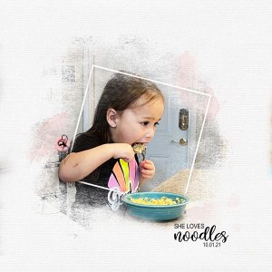
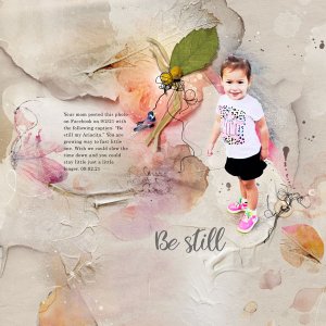
Process The foundation of this layout was created with Page 14 of the Project Template Album No.1 and a Solid Paper and an Artsy Paper blended via a Linear Burn Blending Mode. The focal image was clipped to the FotoBlendz layer of template with a Luminosity Blending Mode applied to the clipping mask and a second copy of my image was placed below the clipping set with a Screen Blending Mode applied to add some brightness to the image. Supporting images and artsy papers were clipped to the frame layers and various layers of the template were turned off. ArtsyTransfers and splatters were placed into the background of the layout and more ArtsyTransfers were placed on top of the focal image as well as lace and word transfers. Dimensional elements, WordArt and journaling completed the page.
- Designer(s) Used:

