Harvest Artplay Palette **artsale coming soon**
Urban Threadz No. 12 http://www.oscraps.com/shop/UrbanThreadz-No.-12.html
Art Word Art Mix No. 1 http://www.oscraps.com/shop/Art-WordART-Mix-No.-1.html
Notes for Photoshop Elements 14
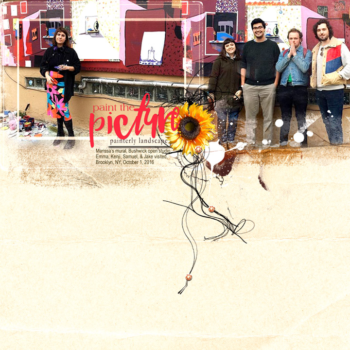
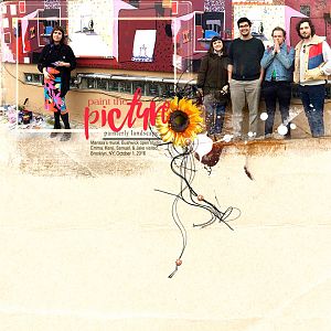
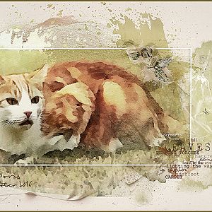
This layout started out as an exercise in experimenting with some of the concepts I've learned so far in Anna's new wordART class...in this case, proximity, alignment, color, and dealing with the (for me) Dreaded White Space. Ha! A lot of things to think about! Easier said than done!
Before I got to that point, though, I fiddled around with the two photos my daughter had texted, assembling them into a linear pathway at the top of the page that felt somewhat panoramic even though the pictures were taken from two different perspectives. (I faired them into each other by clipping the photos to overlapping transfers #13 and #15 from the Artplay Palette, then using the clone tool and a layer mask to fudge a feeling of continuity.) I drew emphasis to the muralist on the left with a dark frame from the APPit was REALLY dark, which didn't work with my layout, but thanks to blending modes I was able to knock out the darkness and leave only the lines by using the screen mode.
I find I often use embellishments not only to add dimension (which I love), but to cover up things that I don't quite have the skills to make the way I see them in my head. The flower, button, and Threadz were just what I needed.
Another memory captured.