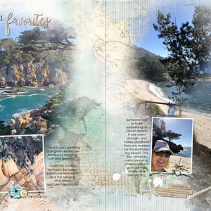
Okay, I lied, I thought I would only do three, but after looking at the wall where they are going to live, Im thinking I needed a more colorful retro page to go with the first one I created to make a more cohesive grouping. Hence, a 4th retro layout.
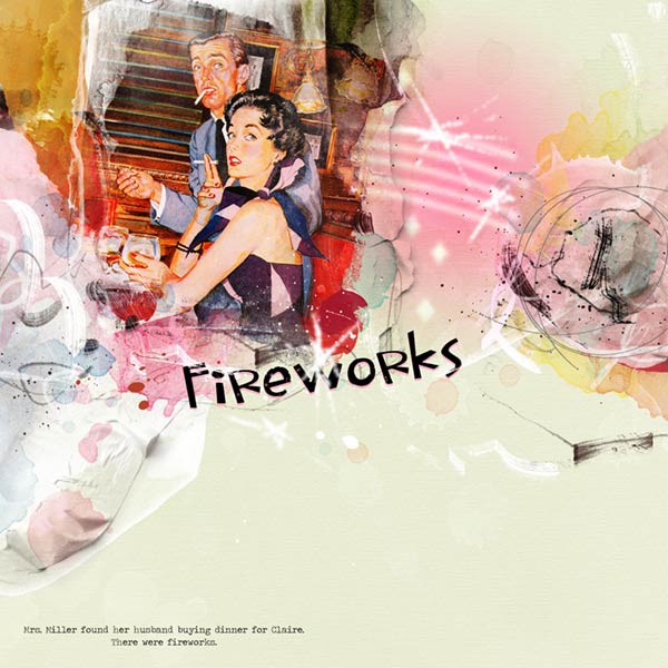
Caption reads: Mrs. Miller found her husband buying dinner for Claire. There were fireworks.
Their guilty faces crack me up. Im hoping the right side of the page looks like a nasty ball of anger.
ArtPlay Palette Euphoria
ArtPlayPaletteEuphoria
ArtsyTransfers Euphoria
ArtsyTransfersEuphoria
Melange FotoBlendz No. 1
MelangeFotoBlendzNo.1
Splatters No. 1
AplattersNo.1
RetroGlows No. 1
RetroGlowsNo.1
DifferentStrokes No. 5 (Retired)
PaperTextures No. 2 (Retired)
DifferentStrokes No. 2 (Retired)
DrippedStains No. 6 (Retired)
Fonts: Traveling Typewriter and LDJ In A Snap
Notes: Starting with artsy paper 2 and clipping the image to the mask. I duplicated the image and blended to Overlay. I built up the page with the artsy transfers under and over the image being careful to give the illusion of the image extending beyond the mask in an artsy way. I also added the paper textures on the right side of the image.
I typed out the caption and title. I had a dickens of a time finding the right font that was both retro and showed emotion. I have a bazillion fonts, lots of which arent even installed yet. I turned off these layers until I was ready for placement.
Underneath the paper texture I placed the fotoglow, blended to Linear Light. Over the glow I stamped the different strokes 5 in white and added a gaussian blur to it to represent fireworks. Later I duplicated it and placed it over the title, resizing and rotating.
I built up the right side of the page with AT tape, stains, art strokes and the pencil scribble from different strokes 2. Mrs. Miller had every right to be pissed.
Going back to the title, I finally found the font I liked best for the job and duplicated it. The bottom layer was recolored pink and moved down a couple of clicks with the arrows keys. Finally I added the pink stain on the white tape at the bottom left of the page to tone down the white. It was blended to Linear Burn. That should cover it.