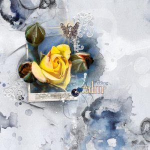
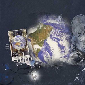
In this layout, I played around with the Posterize adjustment layer on the photo. I then used the Hue/Saturation to change colors because I thought yellow gave more life to the mostly blue page. I can hardly believe that this was a photo of a red rose.
Construction: I used Disquiet palette solid paper #2 for the background. I placed Disquiet FotoBlendz No 1 #2 and clipped my photo to the fotoblendz layer and made a rough extraction of the flower buds. I placed the Disquiet Frame above the Fotoblendz layers and masked out areas I wanted to fade behind the photo extraction.
I added ArtsyTransfers Disquiet #3 and the palette’s artstrokes, transfers and splatters to fill in the background.
For the elements, I added JazzedUp LoopDaLoop No 6 #5 and the palette’s button, lace & angel charm.
Title is Disquiet WordART Mix No 1 Wood Word Calm (Solid Color Fill adjustment at blend mode Saturation) with a modified “Feeling” (Unrest was removed).