Process
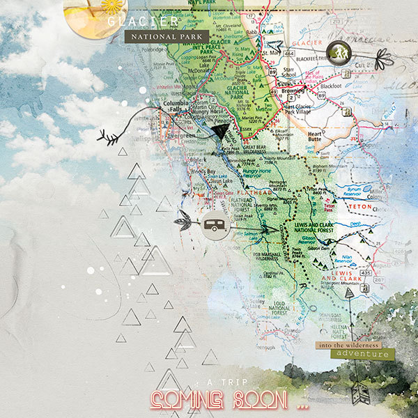
Artsy paper 2 from APP Wilderness was used as the foundation for the page. It was duplicated with the blending mode changed to Multiply with a reduced opacity to darken it. The map was clipped to a fotoblendz mask, duplicated and clipped to another mask to extend the map. I moved the masks around to get the coverage of the map that I wanted. A transfer layer from Artsy Transfers Meadow was added under the map at the bottom of the page. Ellas new arrows (arent they awesome!) were added to indicate some of the areas that we want to visit. The title was created by adding a drop shadow (red), an inner glow (lighter red) and an outer glow (blue) to the text. MultiMedia Arrows, label words and embellishments were added to complete the page.
What a great page announcing the much anticipated trip... the map is perfect and my son's little town is almost in view... looking forward to your documentation... Glacier is a very special place... be sure to go to the Canadian side too... Waterton Lakes
This is such an awesome way to use a map and I love the choice of background paper. Your page is perfect in every way. I hope you have a wonderful trip through the park.
oh, I am "green" with jealousy ... what a wonderful trip to look forward to. please take lots of photos and keep us in mind on your travels. I can't wait for it to begin!
We are National Park Fiends! Bryce, Zion, and Grand Canyon are all arranged for September. I WILL remember how you used the map--it would be a great opening page for the album that will surely come out of our trip. Wonderful work, Miki!
This site uses cookies to help personalise content, tailor your experience and to keep you logged in if you register.
By continuing to use this site, you are consenting to our use of cookies.