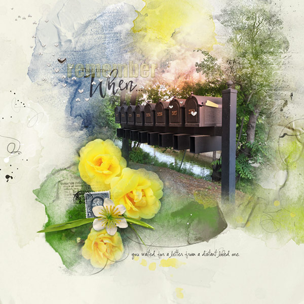
Remember that time when you waited for a letter from a distant loved one.
I adore this row of mailboxes and on this particular day I had to stop and take a photo, not really knowing how I was going to use it in a layout, but use it I would. Then it hit me, of course! I remember back in the day how exciting it was to receive a letter from a loved one far away and I couldnt wait to find a quiet, private place to open and savor each and every word, and most times, reading it more than once. And oh how wonderful it was if a photograph was included in the missive. Letters from loved ones were a treasure to cherish because for a brief moment, time stood still.
ArtPlay Palette Heartland[url=
https://www.oscraps.com/shop/ArtPlay-Palette-Heartland.html]ArtPlayPaletteHeartland[/url]
Trees No. 1[url=
https://www.oscraps.com/shop/Trees-No.-1.html]TreesNo.1[/url]
ArtsyPaint No. 10[url=
https://www.oscraps.com/shop/ArtsyPaint-No.-10.html]ArtsyPaintNo.10[/url]
DrippedStains No. 6 (Retired)
WarmGlow No. 7[url=
https://www.oscraps.com/shop/WarmGlows-No.-7.html]WarmglowsNo.7[/url]
Remember WordART Mix No. 1[url=
https://www.oscraps.com/shop/Remember-WordART-Mix-No.-1.html]RememberWordARTMixNo.1[/url]
MagicSprinklez No. 6[url=
https://www.oscraps.com/shop/MagicSprinklez-No.-6.html]MagicSprinklezNo.6[/url]
Postmarked No. 1[url=
https://www.oscraps.com/shop/Postmarked-No.-1.html]PostmarkedNo.1[/url]
ArtPlay Palette Together (Postage Stamp)[url=
https://www.oscraps.com/shop/ArtPlay-Palette-Together.html]ArtPlayPaletteTogether[/url]
Photos: Mine
Fonts: CK Alis Writing and Impact
Process Notes: Opening artsy paper 4 for my foundation, I brought in the photos and using AnnaBlendz brushes and a reverse layers mask, I brushed the parts of the photos I wanted to show back in. (I will be doing a tutorial showing a couple of tricks that makes this process easy.)
Using the tree brush and and below the mailbox photo in the layers panel, I aligned it with the tree trunk in the photo. With a variety of artsy paint brushes I roughly colored the tree taking the colors from the Palette and clipping the layers to the tree brush. Over this in the layers panel transfers from Heartland was placed on the opposite edges of the paper. Some dripped stains in yellow were also added.
With a Hue/Saturation Adjustment Iayer, I recolored the sun in the paper to match the roses and placed a warm glow over it reaching down to the mailboxes.
The word art/title was placed and recolored using a shade from the mailboxes. Over it I typed out the word remember, gave it a bevel and emboss and turned down the fill opacity leaving it barely there. Then I typed out the sentence below.
The dimensional elements were brought in along with more word art tucked in behind the flower and grass along with a postage stamp which I cancelled with the postage brush. Finally I brought in the little hearts and called it done.