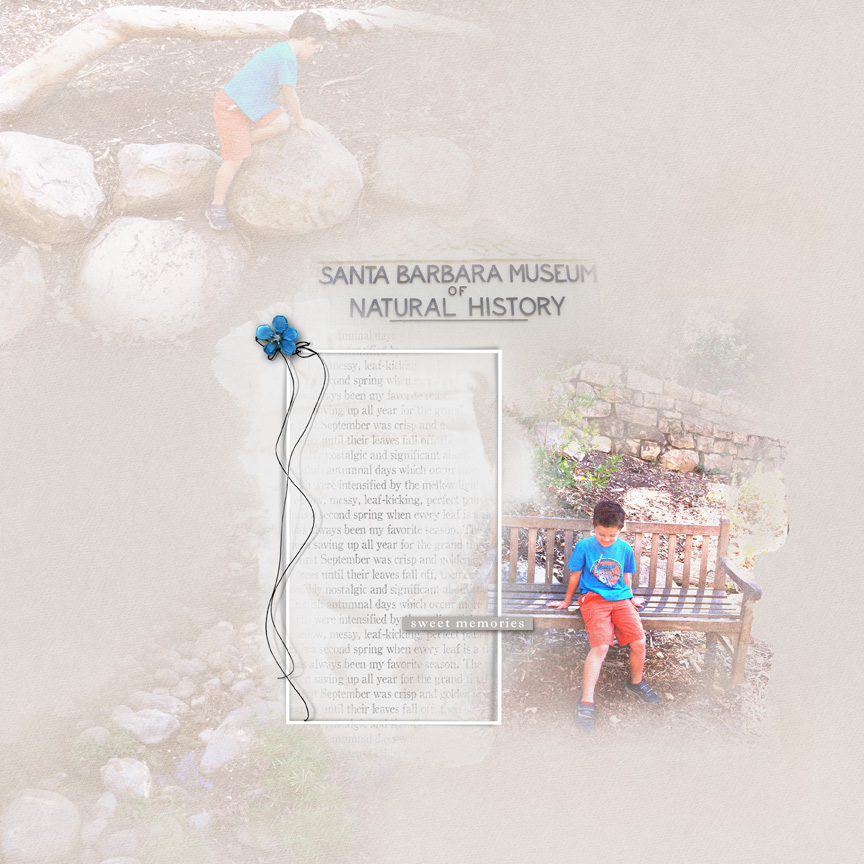
Such subtle use of blending beautifully done and I love the little pop of blue in the flower and the use of thread to frame the journaling! Lovely page!
WOW Vikki - this is a real stunner!!! I love the page design, and I can't quite put a finger on it, but I think the fact that the main photo was blended onto a neutral background (but somewhat softened), and the remaining elements were blended with reduced opacity really gives this layout more impact. I love the placement of the flower and threadz as well, and the blended museum text really gives it a polished look.
Thank you Joan! I was really thinking that all the softness made it washed out looking and nothing to really pop out and grab you! This is exactly what I needed to hear!! Lol thank you!!
This site uses cookies to help personalise content, tailor your experience and to keep you logged in if you register.
By continuing to use this site, you are consenting to our use of cookies.