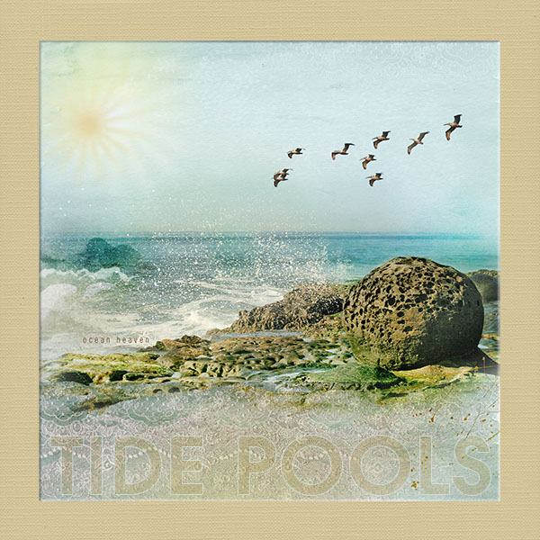
At the Sunset Cliffs tide pools, there are these wonderful pitted, round rock formations that I think are so fascinating. They have not worn away as many of the other rocks have, and just seem so odd.
This is for Annas Ladder Challenge, day 1 everyone that did a page for today inspired me to create one as well.
https://ozone.oscraps.com/forum/showthread.php?t=30077
Everything by Anna Aspnes:
The ArtPlay Palette I used was ArtPlay Salty Living
http://www.oscraps.com/shop/product.php?productid=30847&page=1
I also used:
Different Strokes No. 7
http://www.oscraps.com/shop/product.php?productid=28718&page=1
WarmGlows No. 6
http://www.oscraps.com/shop/product.php?productid=44535&page=1
The Process: I began with one of the Artsy Papers from AP Salty Living. I blended the photo into the paper so that some of the whites and aquas from the paper blended in with the water in the photo. I placed the photo on blend mode Color Burn. With a duplicate of the photo, I blended in just portions of the rockes, to give it more detail, and I blended in the water spray at the tidepools edge. This photo was kept on blend mode Normal, but in the end, I blended on just enough of the second image to give some good detail to both the rocks and the spray. I took the neutral paper with the lace pattern from AP Salty Living (one of my favorite all time papers), and placed just the portion over the bottom of the layout, and placed it on blend mode Multiply. I then used curves to give more contrast to the lace pattern. I placed the word strip by the waters edge, and placed it on blend mode darken, to have only the text show. I added a few brushes and spatters in neutral tones from Different strokes No. 7, and AP Salty Living. I then flattened the image, inserted a solid from the ArtPlay, recolored it the neutral yellow, and placing it behind the flattened image, rescaled the image, to create a border. I beveled the edge of the flattened image to make it look like the solid paper was cut. I then added the warm glow, softened the color and lowered the opacity. Placing it in the corner, I masked out the areas that extended over the outer paper. I chose a bold fonts, and sized it to fit along the bottom. I gave it a stroke in pale aqua of about 8 pixels, and then brought down the fill to about 15%, adding just a touch of color.
Font: ITC Avant Gard Gothic Demi
***thanks for looking***