I can see why Anna says that sticking to one palette makes a layout much faster. That might have been the case except for one thing in my process...
Anna Aspnes's
ArtPlay Palette Shine [url=
http://www.oscraps.com/shop/product.php?productid=10008906&page=1]ArtPlay Palette Shine[/url]
Anna Blendz Artsy 3 [url=
http://www.oscraps.com/shop/product.php?productid=10009049&cat=389&page=1]AnnaBlendz Artsy 3[/url]
Fonts: Quickpen and Garamond Pro
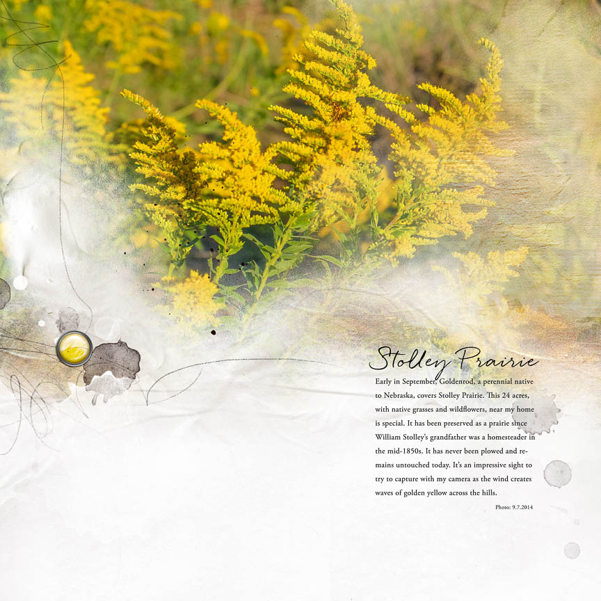
The process: First I experiemented with the size and position of my photograph, finally deciding to place it across the top of my page. Then I chose paper 5 and overlay 1 from the palette to create a boundary for my photo. I used an Anna blend brush to mask out portions of my photo. (I keep this brush set loaded in Photoshop) I placed overlay 3 over part of my photo, setting the blend mode to multiply and reducing its opacity to 35%. I then added transfer 5 for texture on the right of my photo, reducing its opacity to 75%. I repeated paint 1 below, reducing its opacity, to pick up some of the darker color in the photo. I placed transfer 2, paint 1 and two of the strokes on the left to balance where I wanted to place my title and journaling. I added the brad, increasing its vibrancy to match my photo. My layout was almost complete. Then I drove to the nursery to find out the name of the flower covering the Prairie so I could finish my journaling. Now its finished!