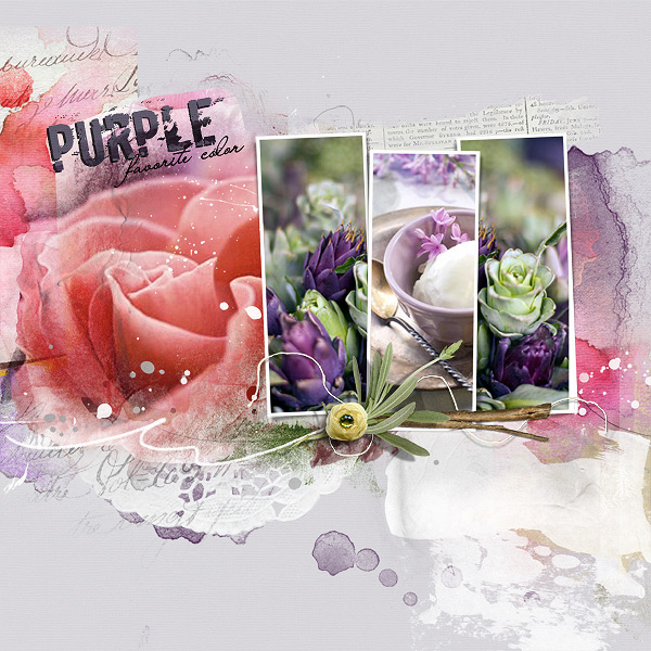
Pictures are from Seeds I get emails from them that show some awesome pallet color combinations. I just had to use these this time .welllllll because as you know I LOOOOOOVE PURPLE.
Process: I placed my photos and cropped them to fit the frames. The salmon color rose I tweaked a bit by adding a gradient map and also Hue and Saturation to make the tones fit better with my beloved purples. Anna always has paint, transfers in her template that you can color by adding additional transfers to them. Some I added a color overlay filter (love this filter) and others I added various Anna overlays to add color. I finished it by adding a focal point with my branch, lavender and button elements.
This site uses cookies to help personalise content, tailor your experience and to keep you logged in if you register.
By continuing to use this site, you are consenting to our use of cookies.