Oscraps

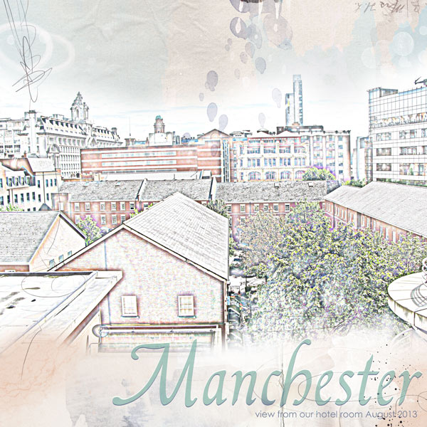
Manchester
tanteva

Manchester

Made with the help of Ana's fantastic tutorial Link
Credits list
Credits:
ArtPlay Palette Getaway

Fonts- Francisco Lucas Llana and Century Gothic

Wrote the title and subtitle in two different fonts. Duplicated the layer, and changed the blending mode on the top layer to Color Dodge. Moved top layer slightly up with the arrow keys. Simplyfied the top layer and erased the part over the subtitle. Selected the bottom layer and changed it's opacity to 71%. Simplyfied layer and used Enhance - Adjust color - Hue/Saturation to get the color I wanted.
Designer(s) Used:
  1. Anna Aspnes
Ooooh, very cool, EVa. And who knew Manchester could actually look quite funky?! Bwahahahaha!!!
 
Dear Eva,
thank you in trying out my tutorial, make the whole difference to know it is useful for you!, I like what you are doing here, it is such an interesting effect!. Thank you in trying out the tutorial, Ann
 
Agree that you have found the beauty in an urban setting which includes industrial icons like the smoke stacks. Great use of Ana's technique.
 

Layout information

Category
Anna Aspnes
Added by
tanteva
Date added
View count
870
Comment count
10
Rating
0.00 star(s) 0 ratings

Share this layout

Top