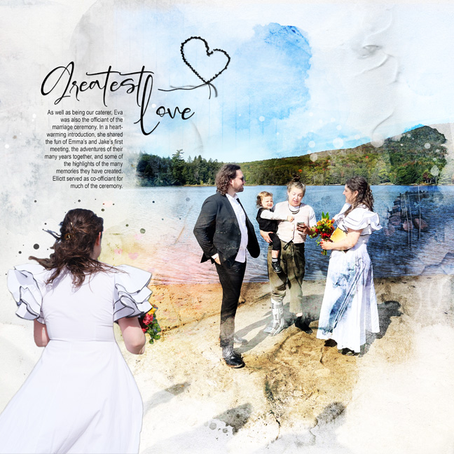
This is another layout for my daughter's wedding album, using Artsy Transfers as a base. The thing I love about Artsy Transfers is that I can customize each and every layer, even integrating several Artsy Transfers in a layout if it suits my purposes. Because most of the pictures in this album are essentially the same (bride! Groom!) I am finding myself going a little bit more “moody” in the design—which is pretty far off off my usual literal approach to storytelling, where maintaining the clarity of the imagery is way more important than the artfulness. In this layout I started with an Artsy Transfer, then worked duplicates of my photo (different blend modes) into it, layer-masking away all the weird bits. The way this works best for me is to roughly position the image, then turn off all the AT layers, clicking them back on one by one starting at the bottom, altering/deleting/moving as needed. I added a stitched heart because one of the design motifs in the album is stitched shapes (earlier pages have a camera Threadz and a leaf Threadz). The background is Equinox Solid Paper 1. I could not resist sprinkling on a FotoGlo at the end—it's a wedding after all.
To pop the faces, I duplicated the photos once again and clipped them to a face-sized fotoblendz. Some spackle texture brushes added a little dimension.


