Oscraps
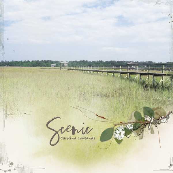
- Credits list
- Natalie: Smile for the Sun: https://www.oscraps.com/shop/Smile-for-the-sun.html
AASPN MultiMedia Branches 13:https://www.oscraps.com/shop/MultiMedia-Branches-No-13.html
AASPN Scenic Template Album 2 mask: https://www.oscraps.com/shop/Scenic-Layered-Template-Album-No-2.html
JBrisebois Still Life Collection Black Inked Overlay (re-colored): https://www.oscraps.com/shop/Still-Life-Collection-Black-Inked-12x12-Overlays-Element-Pack.html
Font: Bradley Hand
- Designer(s) Used:


