Oscraps
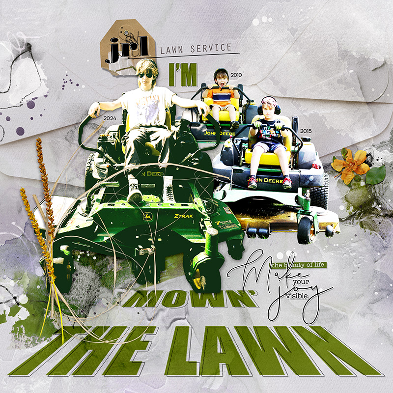
I'm Mown' the Lawn
- Miki
-
- Tags
- lawn mower
- Credits list
- This limited option is back at a 50% discount and now includes the coordinating ArtsyTransfers. This product will no longer be available after September 25, 2024 at 9am EST.
Artplay Vie Collection
Artplay Palette Vie (paper, overlay, label word)
Artsy Transfers Vie
MultiMedia Branches 14
Life WordART Mix 2
Artplay Palette Autumn Elegance (straw)
Artplay Palette Sol (grass)
Paper Textures 21
Process
Solid paper 4 from APP Vie was used as the foundation for the page. Artsy paper 2 was added, then shifted shifted downward so that the texture was closer to the bottom of the page. A layer mask was added and using the gradient tool, the papers were blended so that the hard edge didn't show. The photos were extracted and added. The title was created using the vanishing point filter and then adjusted using the perspective tool in free transform. Artsy Transfers Vie_2, overlays, splatters were added, along with a paper texture. A MultiMedia Branches flower placed on the right side. The page was completed by adding word art and dimensional embellishments.
Thank you for looking!
- Designer(s) Used:


