Oscraps
- Credits list
- This limited option is back at a 50% discount and now includes the coordinating ArtsyTransfers. This product will no longer be available after July 24, 2024 at 9am EST.
Artplay Lost Collection
Artplay Palette Lost (paper, transfers, splatter, blossom)
Artsy Transfers Lost
Urban Threadz 21
Lost WordART Mix 1
Easy Torn Edge Templates 3
Artplay Palette Relative (paper)
Artplay Palette Sojourn (ticket)
Artplay Palette Golden Glory (paper)
Artplay Palette Wayfaring (slide)
MultiMedia Homes 1
Multi Media Kindred 1
Paper Textures 20
Process:
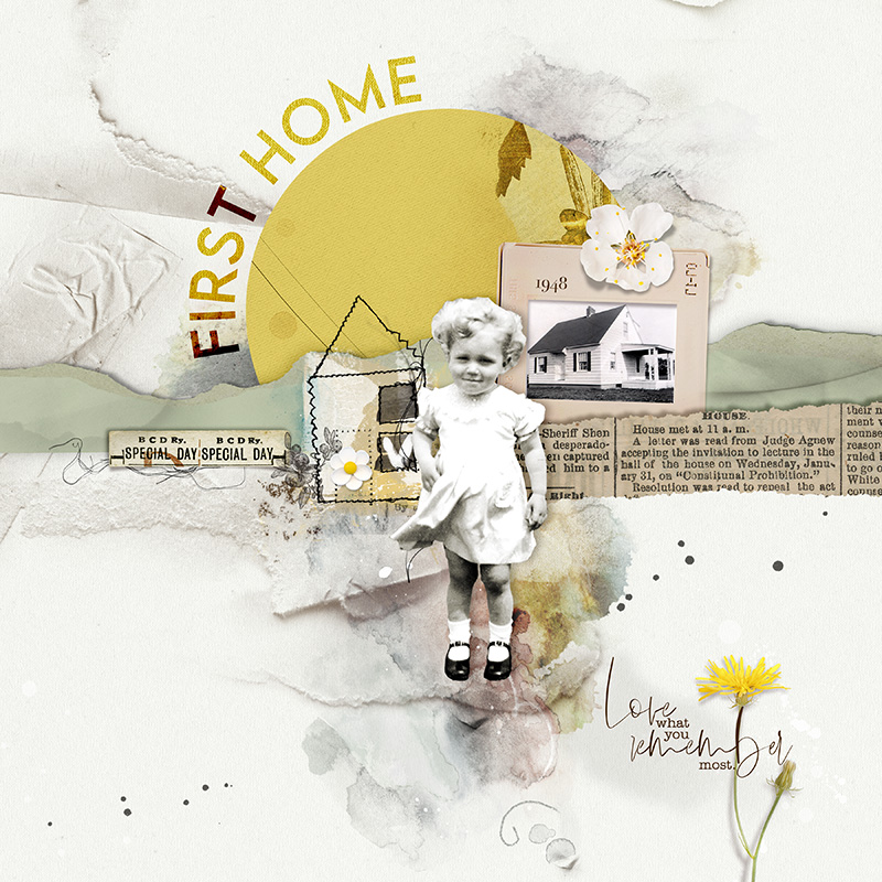
A solid paper from APP Lost was used as the foundation for the page. A solid paper from APP Relative was clipped to an Easy Edge Torn Templated. The layers were merged and rotated horizontally. The top (torn paper) edge was cut and added to the page. This became the background landscape. Paper textures were clipped to the landscape. A layer mask was clipped to the paper textures and using a black brush, areas were erased. The photo of the house was clipped to the frame mask of the slide. The image of the girl (me) was extracted with custom shadows added. A circle was cut from an artsy paper from APP Golden Glory. Transfers and splatters from APP Lost were added. Artsy Transfers Lost_4 was added. Using the level adjustment tool, the layers were lightened. The page was completed by adding word art and dimensional embellishments.
Thank you for looking1
- Designer(s) Used:


