Oscraps

Cape Escape 04-05
musicmom3

Cape Escape 04-05

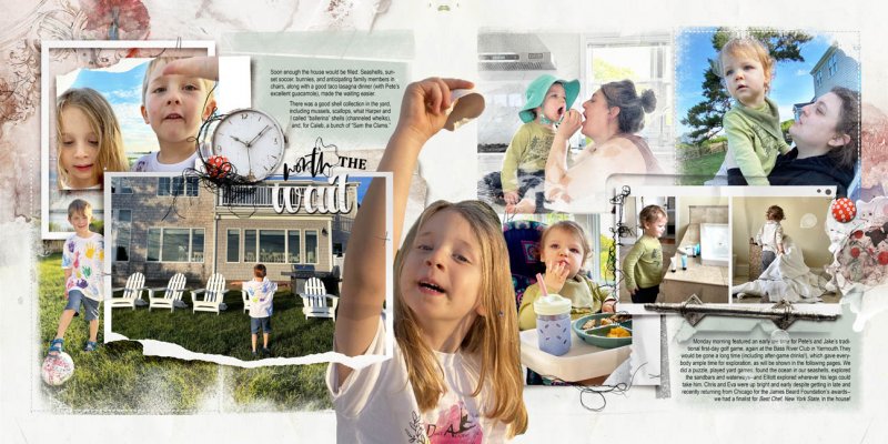
My process for this album has been to batch-produce a number of spreads, altering the templates, placing the photos, and writing the stories while they're fresh in mind, then moving on. As I now go back to finish up this first batch of spreads, I've found that working formulaically is helping to ward off my usual finish-the-page bog-down. What's working for me is choosing a background paper for the spread, background papers for the text boxes, and then one or more Artsy Transfers color-coordinated with the photos to add the layers of texture that I like. In this case I also supplemented with a matching ArtsyKard. I am keeping embellishments to a minimum and avoiding the rabbit hole of too many choices. No doubt I will return to all of these spreads well before printing to add stuff and make refinements, but my goal now is to reach the finish line sooner than later, so I can shop the printing sales and guarantee my albums will be ready to gift for Christmas.
.This is a spectacular double page spread and that extraction is OMG, my chin hit the floor, well- done the placement on the page is perfect. Love the way you display your photos; I think I'm going to bookmark this :)
 
What a wonderful double page to display your great photos! I love your process and will try to implement it on my own pages. The devil is in the details which oftentimes causes bog-downs and the detour down the rabbit hole. Thanks for sharing your helpful process.
 
You have an excellent plan,this shows motherhood and childhood with an artsy flair.Will be a keepsake..You go girl..
 
Looks like your plan is working very well. Loved reading your process notes. And congrats on the SO! The extraction alone is worth that! Very cute pics.
 
Your process sounds very well thought out and seems to be working well for you. I love how all the photos are layered on the background and that you left space to tell your story!
 
congrats on the standing o.
I think your approach is efficient and clever and leaves you plenty of room for original ideas at the end to make the whole thing really special.
With an album, you have to keep an eye on so many details that it's very easy to get lost in them.
 
.This is a spectacular double page spread and that extraction is OMG, my chin hit the floor, well- done the placement on the page is perfect. Love the way you display your photos; I think I'm going to bookmark this :)
Thank you so much! I usually print lay-flat books for gifts because the littler kids have an easier time with the pages, and I love to stick an extra photo in that center area--makes me feel like I'm getting my money's worth!
 

Layout information

Category
Anna Aspnes
Added by
musicmom3
Date added
View count
533
Comment count
15
Rating
0.00 star(s) 0 ratings

Image metadata

Filename
anna-aspnes-digital-scrapbook-fotoinspired-template-album-3G-holmes8.jpg
File size
225.7 KB
Date taken
Tue, 25 June 2024 3:20 PM
Dimensions
1296px x 648px

Share this layout

Top