Oscraps

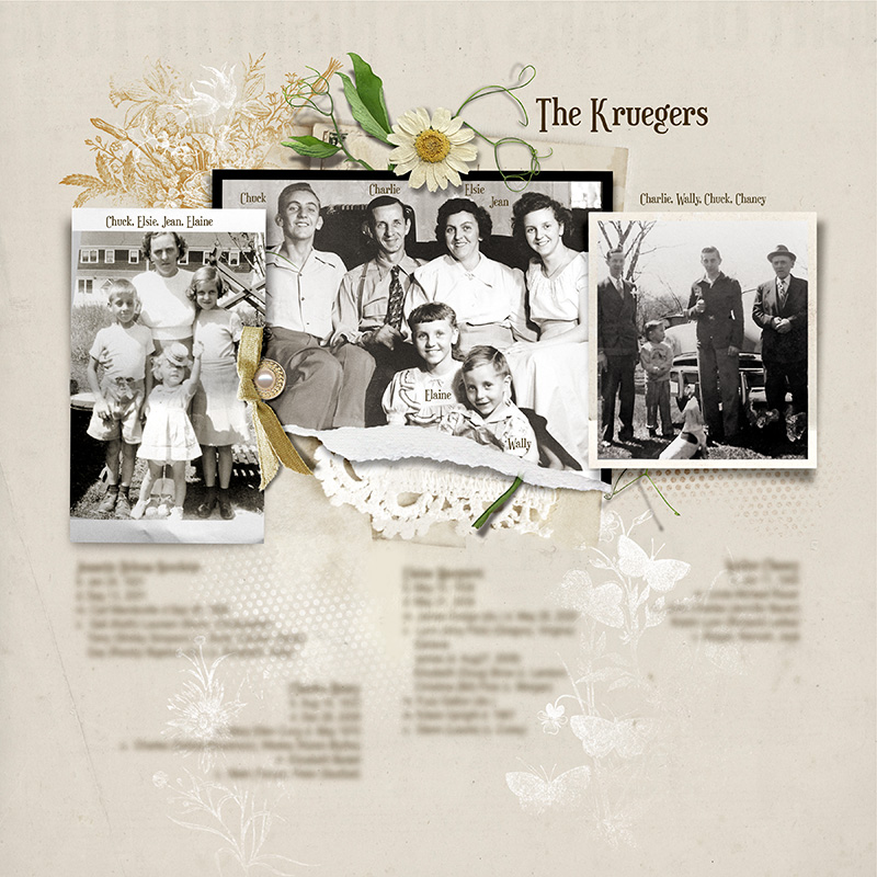
The Kruegers
Miki

The Kruegers

Credits list
FotoInspired Template Pack 3E (frame)
FotoInspired Template Pack 3C (frame)
Framed Masked 12
Flower FotoBlendz Template Album 1 (flower and dot brushes)
Artplay Palette Jouissance (paper, foliage, transfer)
MultiMedia Documents 8 (ribbon)
MultiMedia Suns 5 (daisy)

Process
A solid paper from APP Jouissance was used as the foundation for the page. Three different frames from FIT Pack 3E, FIT Pack 3C and Framed Masked 12 were added. The frames were resized. The middle frame was recolored black to add some contrast to the page. Family photos were clipped to the frame masks. A variety of flower and dot brushes from the Flower FotoBlendz Template Album 1 were stamped in white on the lower half of the page. This provided a subtle background for the family names. The page was completed by adding dimensional embellishments and a transfer.

Thank you for looking!
Designer(s) Used:
  1. AFT Designs
  • Love
Reactions: NAdams and bcazzell
Wonderful old photos and really like the torn frame in the middle with the bit of lace underneath. Gorgeous page!
 
Agree,love the warm images of the family. I like the text identifying each one and the daisy tops it all off.
 
Love how you're sticking with the horizontal designs. Classic! This will be a fabulous book.
 
I love these old pics and your design with the simple embelishment is stunning!
 
love your gorgeous vintage page with beautiful old photos and all the perfectly fitting elements
 
It is fun to have heritage photos to create pages with and a good way to share that heritage with other family members.
 
First of all, love the photos, then the great variety of frames. The subtle brushwork is lovely! Curious as to how you blur the journaling? I've tried various things but worry sometimes that it's still readable. Yet if I leave it out, the page looks weird.
 
First of all, love the photos, then the great variety of frames. The subtle brushwork is lovely! Curious as to how you blur the journaling? I've tried various things but worry sometimes that it's still readable. Yet if I leave it out, the page looks weird.
Thanks! I duplicate the text layer then rasterize it and add a Gaussian blur. Turn the original text layer off.
 

Layout information

Category
Anna Aspnes
Added by
Miki
Date added
View count
318
Comment count
11
Rating
0.00 star(s) 0 ratings

Image metadata

Filename
anna-aspnes-digital-scrapbooking-fotoInspired-template-pack-3G-miki-kruegers.jpg
File size
240.3 KB
Dimensions
800px x 800px

Share this layout

Top