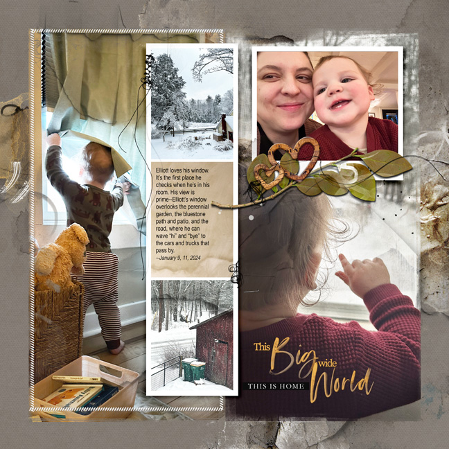
Lately the hue/saturation in Photoshop Elements (I use version #14) has been a lifesaver. As I was finishing up this FotoInspired layout, I really liked the look of the leafy multimedia element from the Hygge collection, but the bright green just did not work with the muted gold tones of the rest of the design. Hue/saturation to the rescue! Otherwise, this template layout was very simple. I combined all the frames on the right side of the template into one to feature the big picture and used five of the new paper textures to add some dimension to the work.

