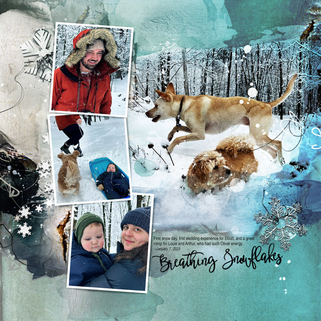
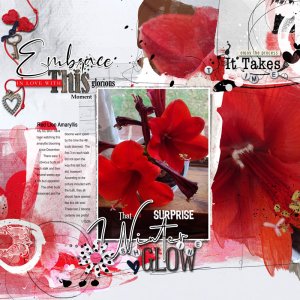
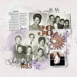
This is a blended layout, with the photo and two duplicates blended directly into the background paper (Artsy Paper #1), so I made good use of the blending brushes in this set. I added the frames and some artistry layers from the template, and then added Artsy Transfers to spread more color and texture around. Multimedia Elements filled in some blank spots. I found myself obsessing about the colors in this layout and had quite the philosophical self-debate about color references owing to the relationships of the hunter green in the baby hat and the blue of the sled, not to mention the orange in the parka. In the end, I poured a glass of wine and decided to just let it be. Ordinarily in this sort of pickle I would employ a tried and true device such as a visual triangle for unity's sake, but I couldn't seem to make that work. Which tells me I either don't really need it, or that I needed that glass of wine more. UPDATE: Halfway into that glass of wine, I added a gradient to the layout on the right edge of the page that was the blue color of the plastic sled (color burn, 46% opacity) and used an artsy brush to layer-mask the blue off the blended photo. Voila. Enough unity created to put the layout to bed.

